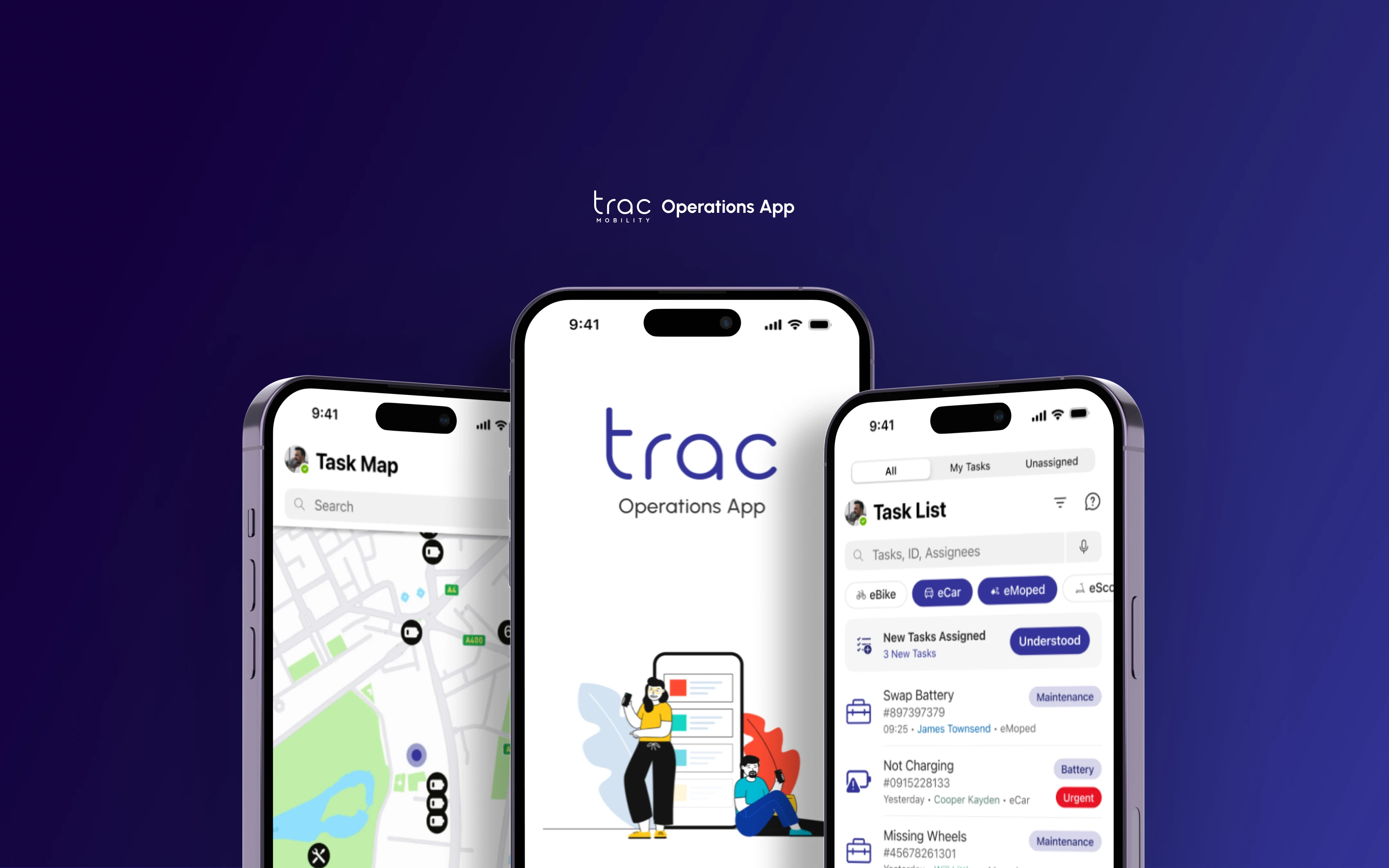
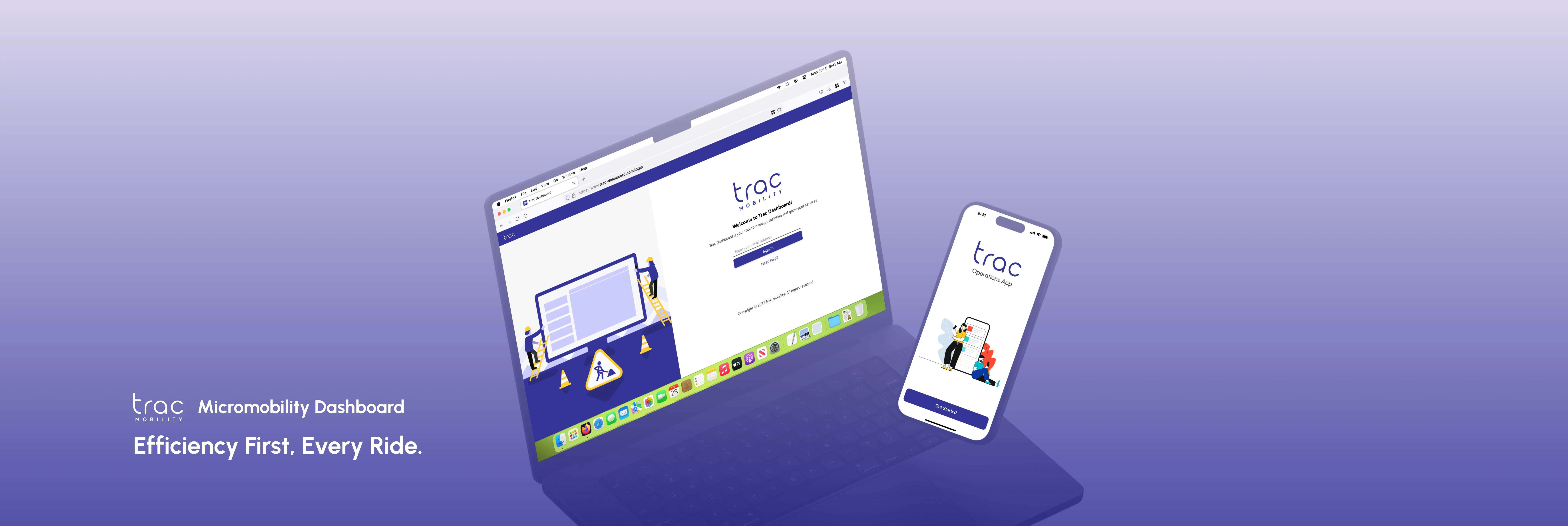
TRAC Mobility Dashboard
Micromobility Dashboard
TRAC Dashboard is a platform, tailored for micromobility providers, offering tools to manage fleets, teams, and customer interactions efficiently.

Problem Space
The TRAC Dashboard focuses on addressing the inefficiencies and complexities in managing micromobility services and fleets. Many businesses in the micromobility sector face challenges in centralising and streamlining their operations, often relying on multiple disconnected systems and tools. This fragmentation leads to difficulties in tracking fleet performance, managing inventory, monitoring customer service, and executing marketing efforts effectively. Due to the complexity of the product, businesses will need to rely heavily on customer support, making fleet management and customer service core to ensuring smooth operations. Additionally, the lack of scalability in existing solutions makes it harder for businesses to adapt and grow as their needs evolve. TRAC Mobility aimed to solve these problems by offering an integrated, user-friendly platform that centralises all key functions into one cohesive, scalable system designed for future expansion.
Secondary Research of Micromobility Platforms
Colleague & Client Interview Extracts
Speaking with colleagues and clients familiar with the existing dashboard on a regular basis, I aimed to uncover their struggles, common tasks, and goals. These discussions helped identify key pain points and the features needed for more efficient workflows.
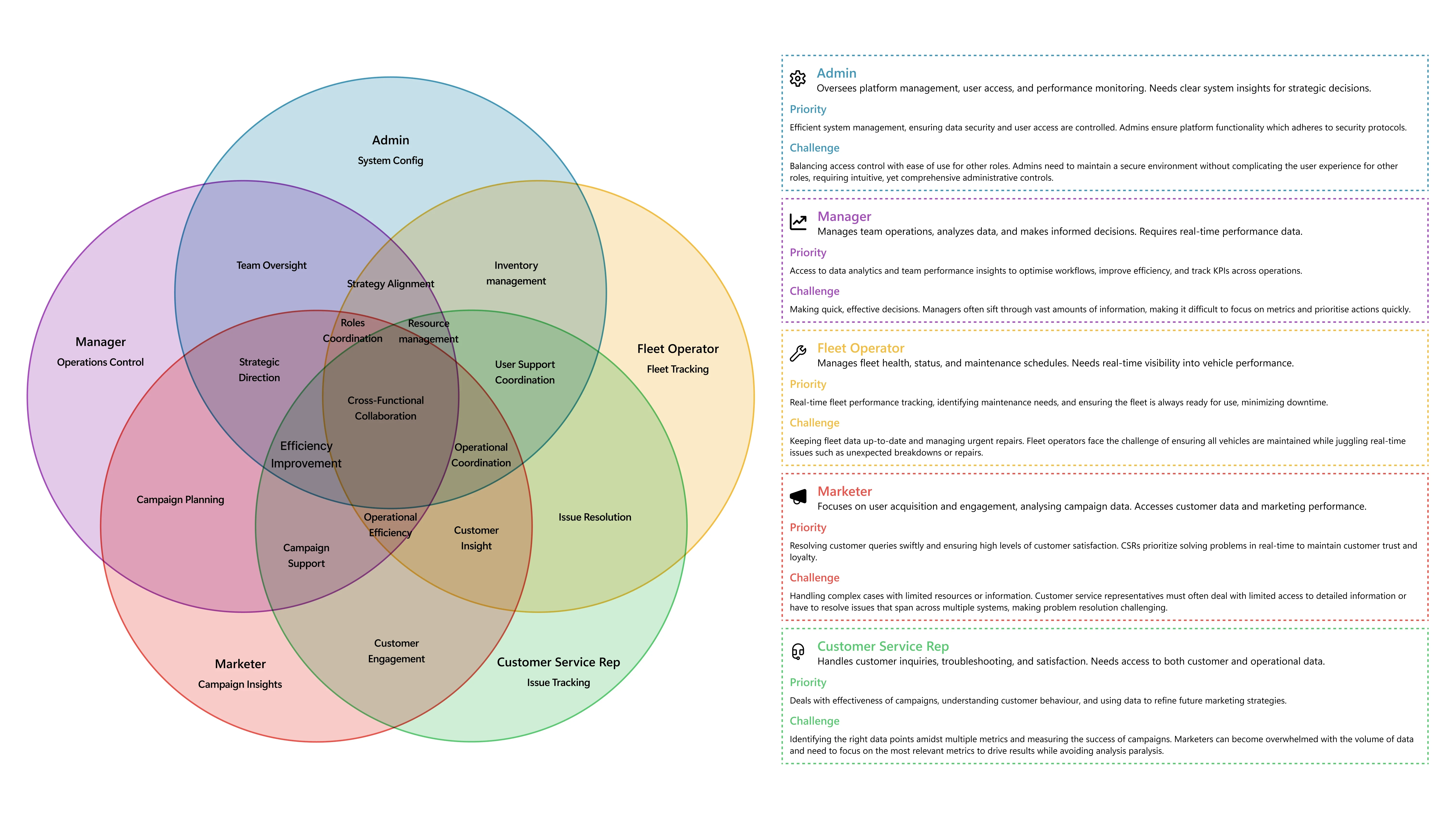
Role Relationships
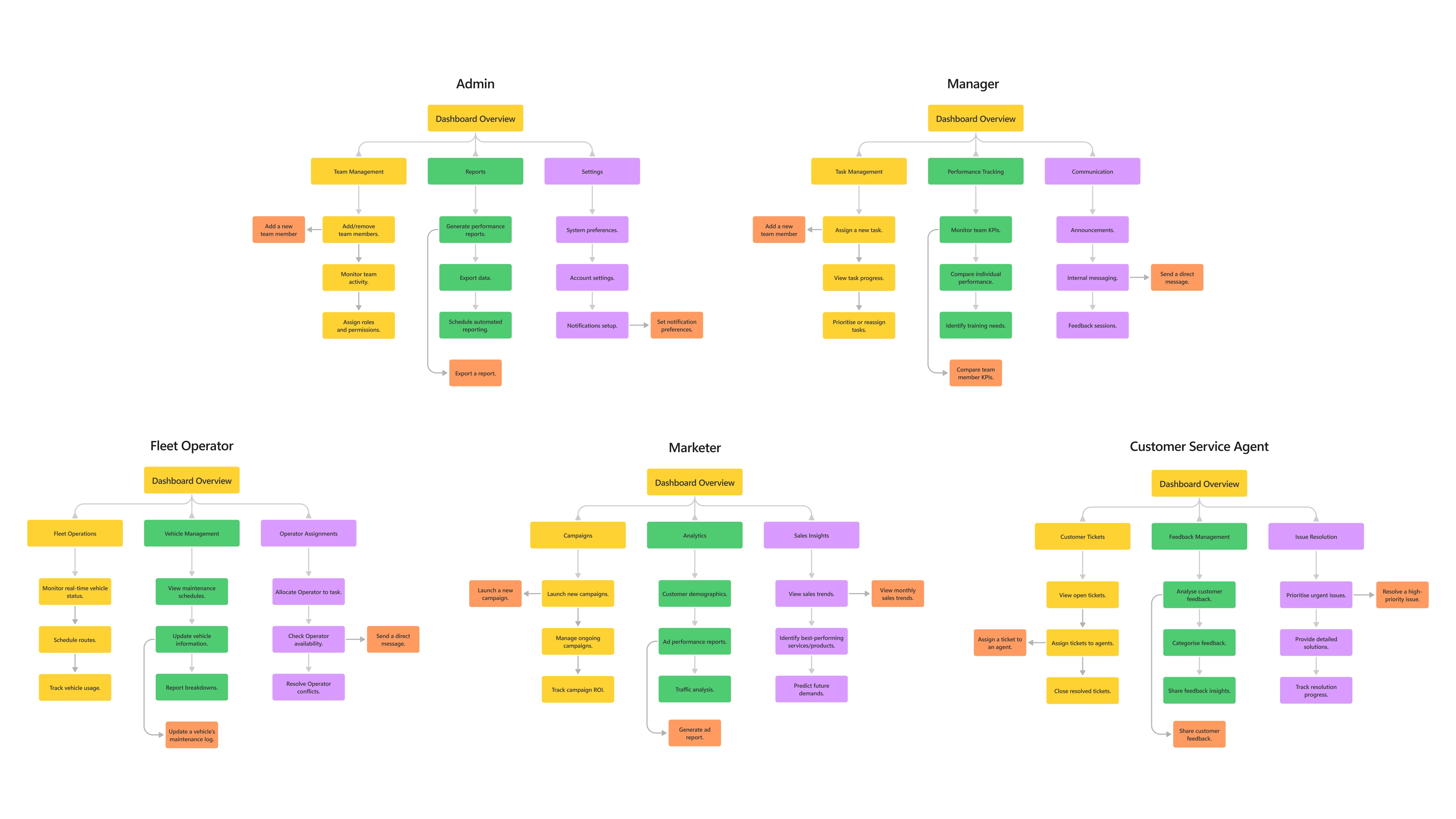
Role-Specific Navigation Map
How can we create a comprehensive and user-friendly dashboard that addresses the distinct, complex and overlapping needs of micromobility service roles, ensuring seamless management and collaboration?
Original vs Refresh
This side-by-side view highlights the dashboard’s evolution from its original design (2021–2022) to the personal refresh (2023). The original, created in Adobe XD with community-sourced Fluent resources, met basic requirements but had design limitations. The refreshed version, built in Figma with official Fluent 2 Web assets, enhances layout, accessibility, and user experience, fully aligning with Fluent Design principles. This comparison showcases the shift from meeting project basics to refining the design with updated tools, skills, and a user-focused approach. Navigation was streamlined, merging related pages and improving context for a more functional and intuitive interface.
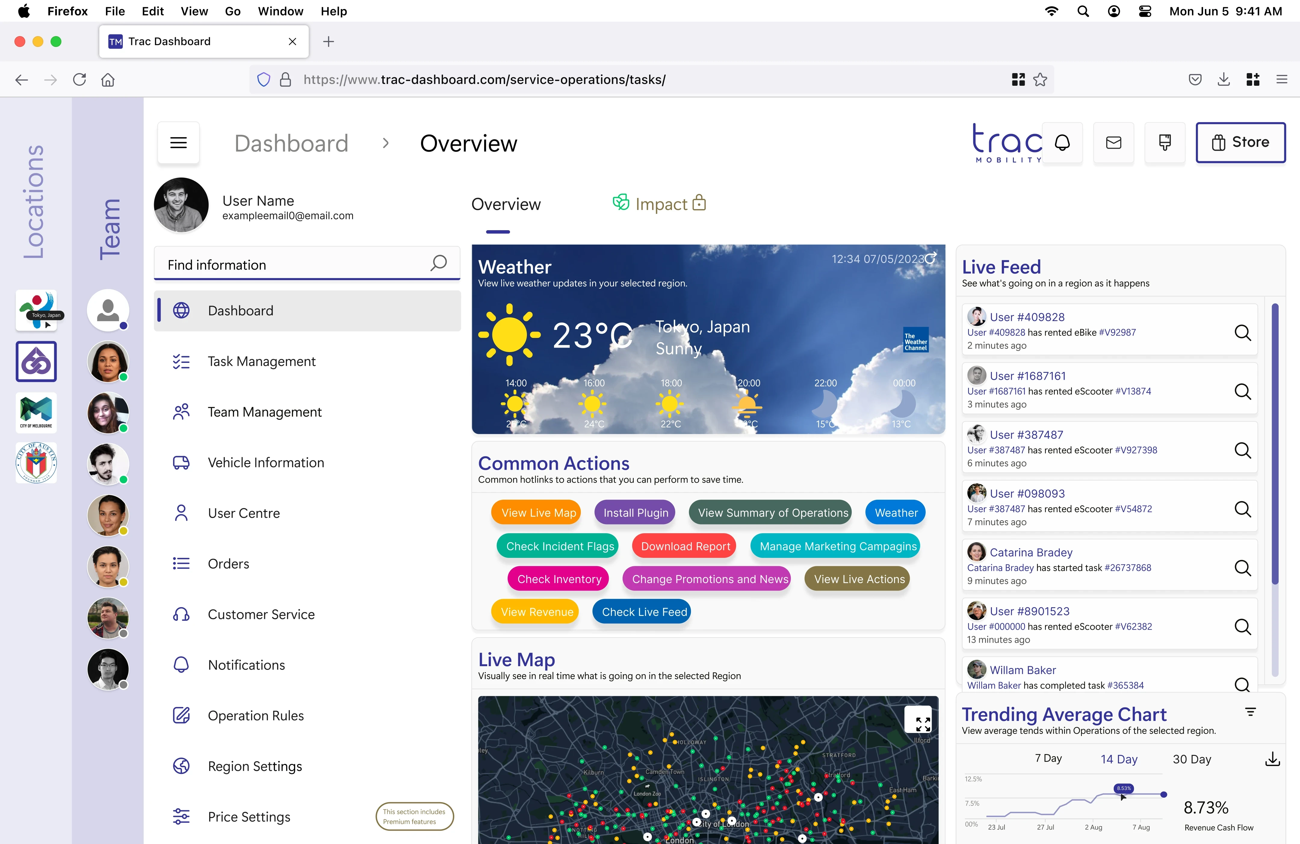
Dashboard
Featured a two-column widget layout, including weather, common actions (shortcuts), a live trending chart, and a live map. Notification, messages, customisation, and store link buttons were fixed in the header.
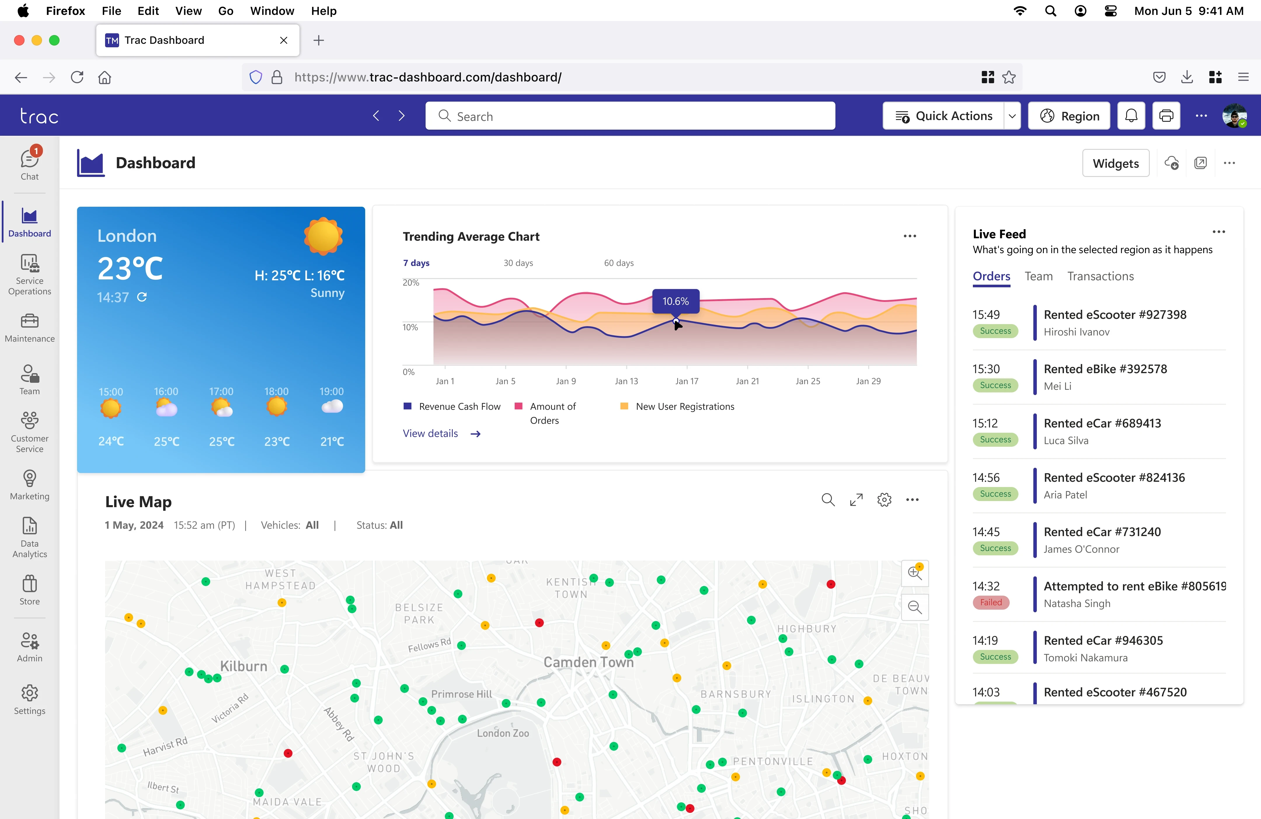
Dashboard
Widgets were redesigned for clarity and readability, adhering to Fluent Design System principles. Common actions were removed, and the side menu was revamped. The live map became larger, clearer, and gained optional filters. Header buttons were replaced with streamlined widget editing, download, share, and options buttons.
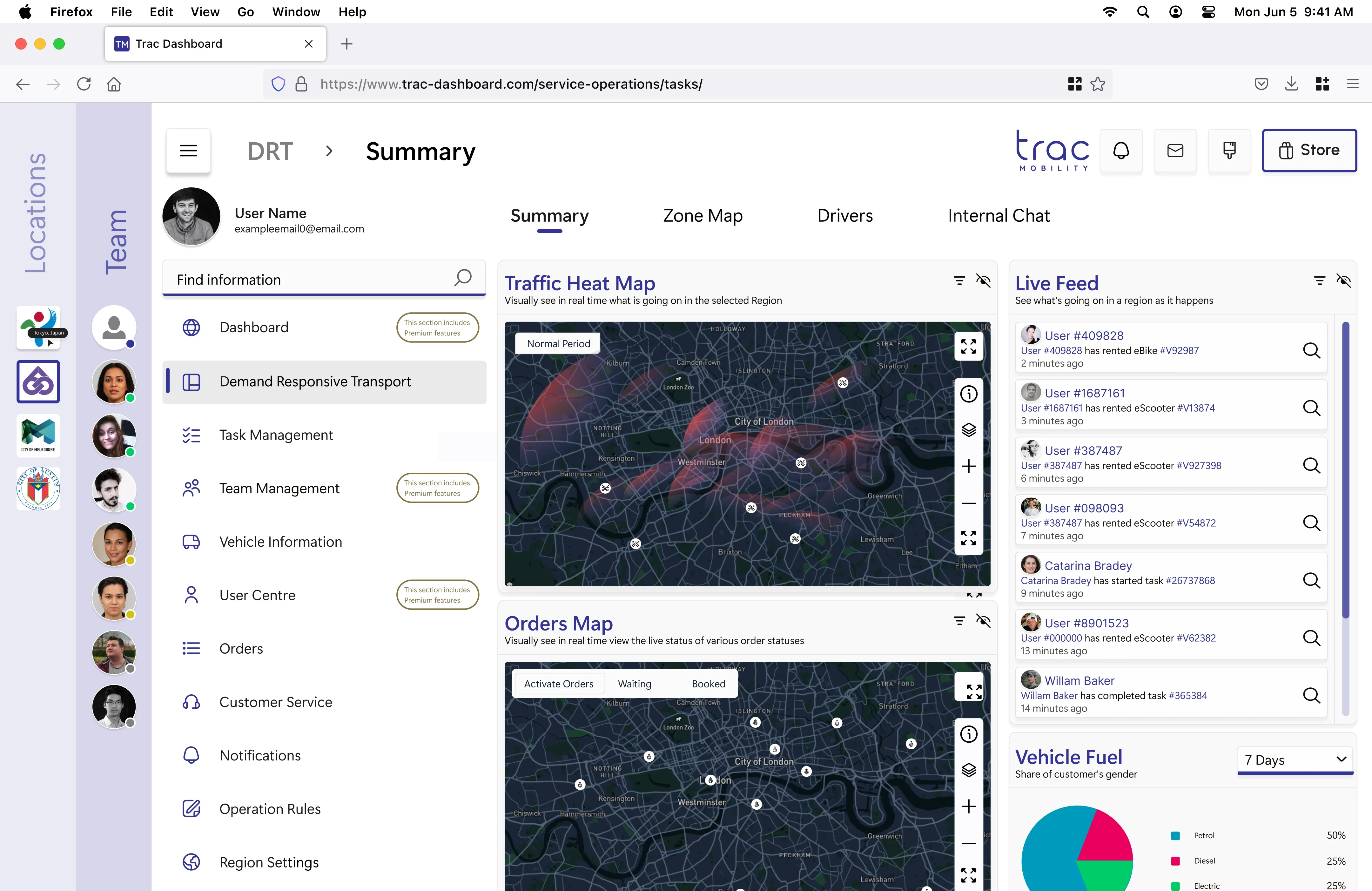
Live Operations
Known as DRT (Direct Responsive Transport), it included a traffic heatmap, an orders map, a live feed of orders, and a pie chart for vehicle fuel types. Maps could be viewed in full screen.
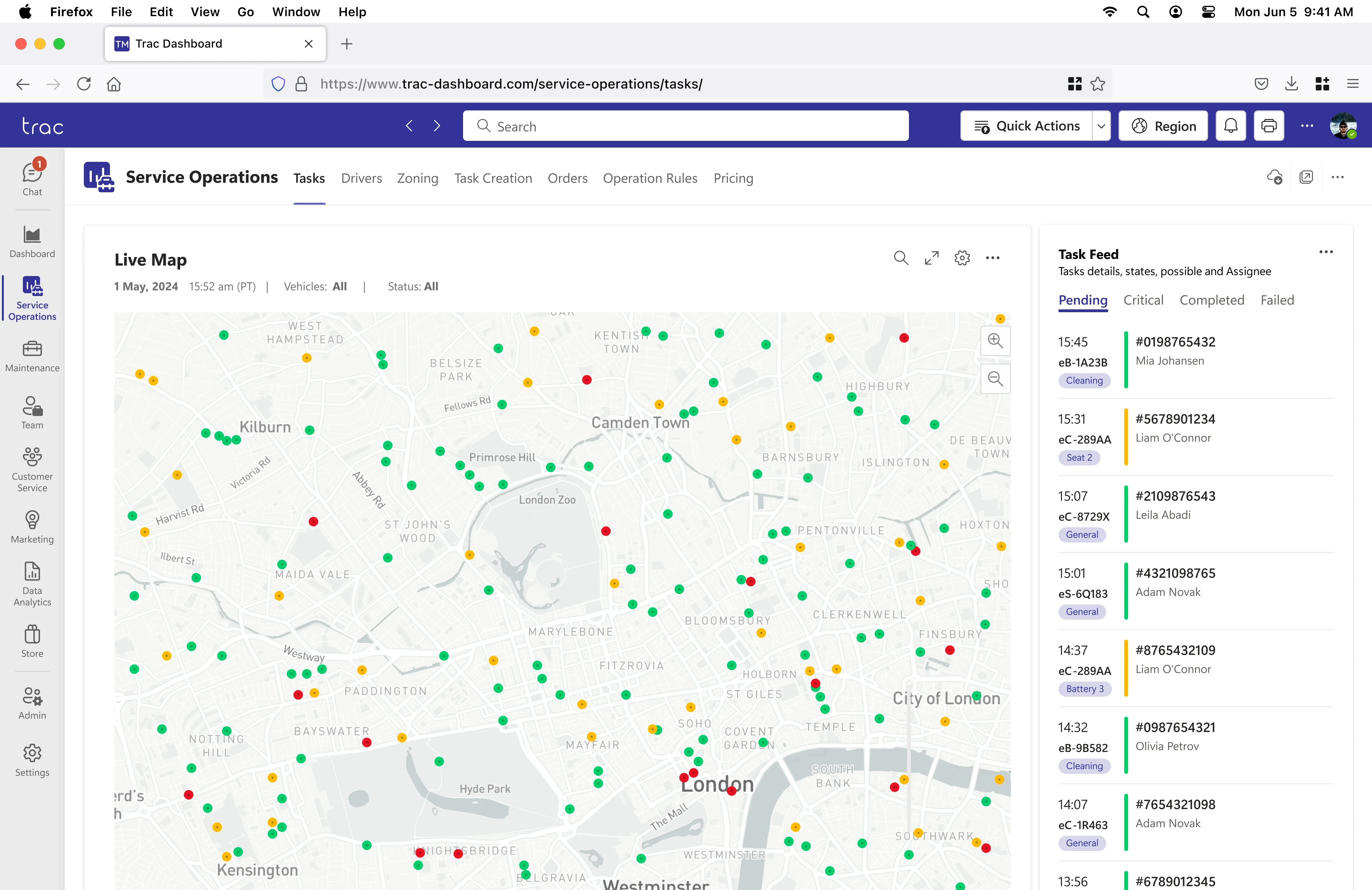
Live Operations
Renamed Service Operations for clarity. The order and heat maps were moved to dedicated tabs, and the live map now provides a general service overview with filters and full-screen options. The live feed was replaced with a task feed featuring status-filtering tabs.
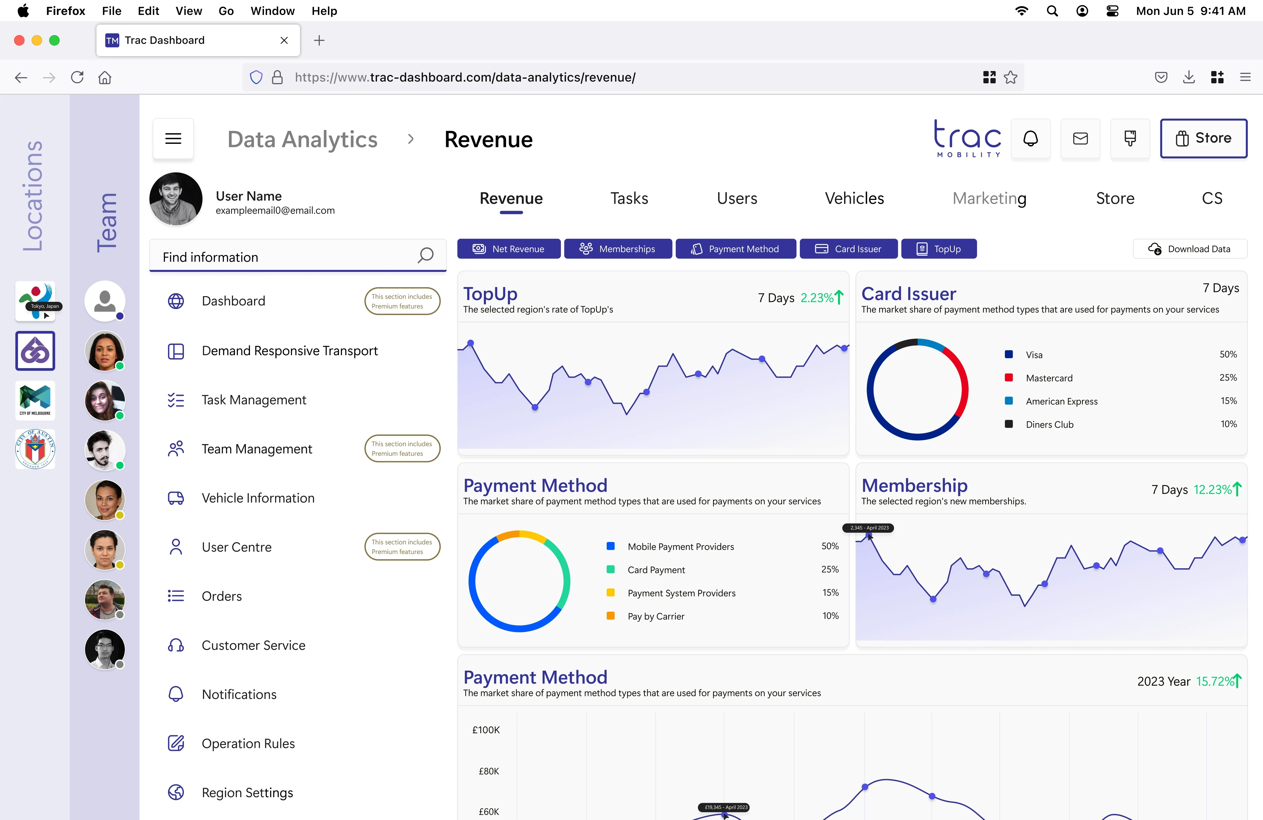
Data Analytics
The landing page displayed revenue data and widgets for commonly viewed metrics. A toggle system allowed users to turn widgets on or off, and a download button was present for data export.
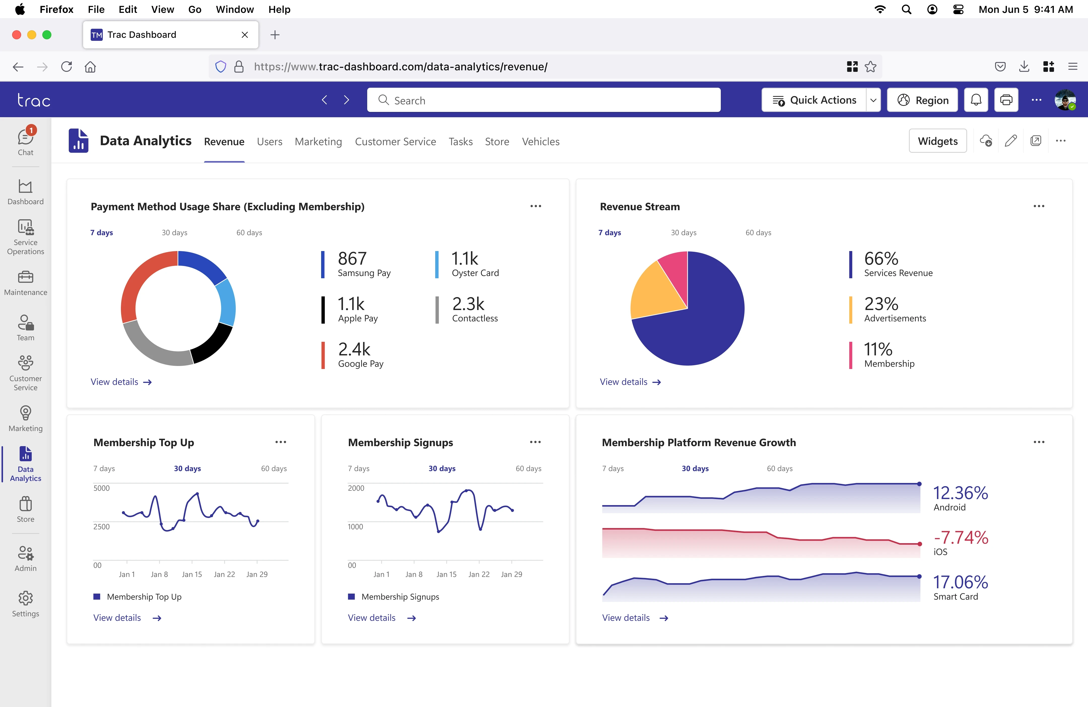
Data Analytics
Charts were redesigned with improved clarity and better labelling, and quick links were added for direct navigation to specific data. The widget toggle system was replaced with a consistent widget options button, aligning with the dashboard.
High Fidelity Prototype


Design System
This project utilised the Microsoft Fluent Design System for its well-defined framework and neutral aesthetic, avoiding alignment with any single brand identity. A 2023 personal refresh incorporated Microsoft Fluent 2 Web and Fluent System Iconography in Figma to address design flaws of the original project, apply new skills, and reflect my transition to Figma.
During the original design process at TRAC Mobility (2021–2022), Adobe XD was used. In the absence of official Fluent files for Adobe XD or Figma, community-created resources were leveraged to ensure adherence to the design system.
Project Thoughts
The TRAC Dashboard was my first major professional design project, marking a transition from university work to real-world applications. Initially, it was daunting, with a steep learning curve and the challenge of impacting an already live product. Through extensive iterations, experimentation, and learning about design systems, I grew significantly as a designer during the process.
Returning to this project in 2023, with more experience, allowed me to refine and elevate the original design from 2022. The improvements highlight my growth in confidence, skills, and ability to tackle complex challenges. Reflecting on this journey, it was both a valuable experience and a foundation for building future expertise.
Previous
Next