Microsoft Translator Redesign
Audio Companion App
Microsoft Translator is a multilingual translation and conversation app
Problem Space
The Microsoft Translator app is missing essential features like the ability to share or copy translations, which users expect. Many functions are hidden or poorly explained, making them difficult to access. The design is outdated, with inconsistencies across the interface, and it doesn’t reflect Microsoft’s current branding. Dark mode is also absent, adding to the app’s lack of modern usability.
Secondary Research of Escrow Services
User Reviews
Real user reviews from the App Store and Play Store highlight the overall lack of structure in the current Translator app and make it clear there are opportunities to improve it into a compelling product.
Designing for diverse users
Creating distinct persona groups helps understand user challenges and goals. By analysing characteristics, needs, and commonly used apps, tailored needs can be effectively addressed.
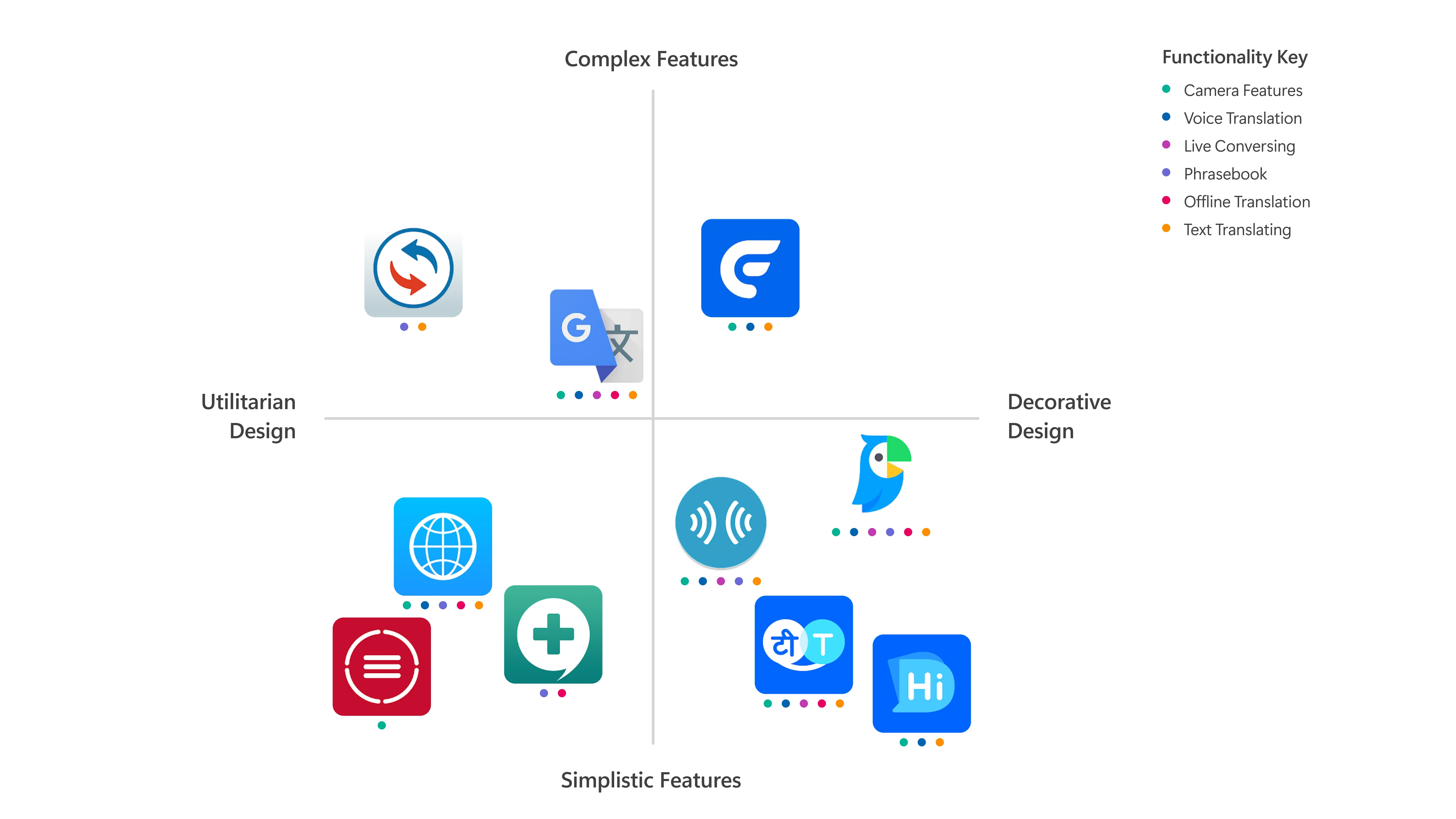
Comparative Features
The spectrum diagram compares features of leading translation apps, using colour-coded markers to represent specific functionalities. Examining the distribution of features across competitors highlights the strengths of the overall market, areas that have been underdeveloped, resulting market gaps to innovate and exploit. These insights directly inform decisions in the redesign process, ensuring that Microsoft Translator evolves to meet and exceed user expectations.
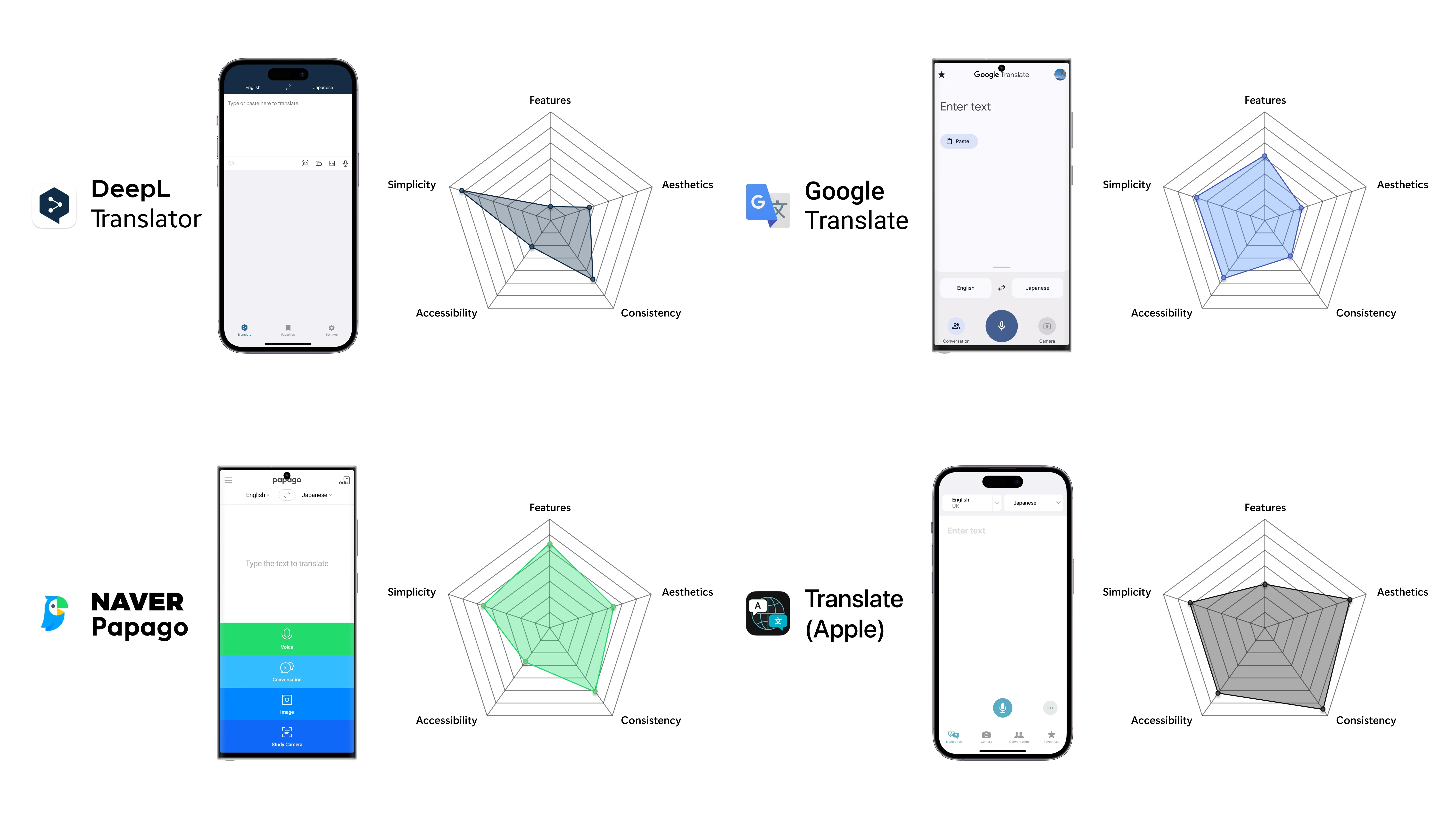
Competitor Evaluation
The big four competing translation apps were evaluated against critical design principles: simplicity, aesthetics, consistency, and accessibility. The comparison revealed which attributes competitors excel in and where they fall short. This data-driven approach enables the new Microsoft Translator design to focus on opportunities for differentiation and improvement. By understanding how strong competitors perform, the redesign can be strategically tailored to deliver a superior user experience that stands out in a competitive market.
How might a redesign of Microsoft Translator enhance usability, cater to the diverse needs of its global user base, and deliver a fresh, energised experience that repositions the app as a leading translation tool?
Mapping the User Experience
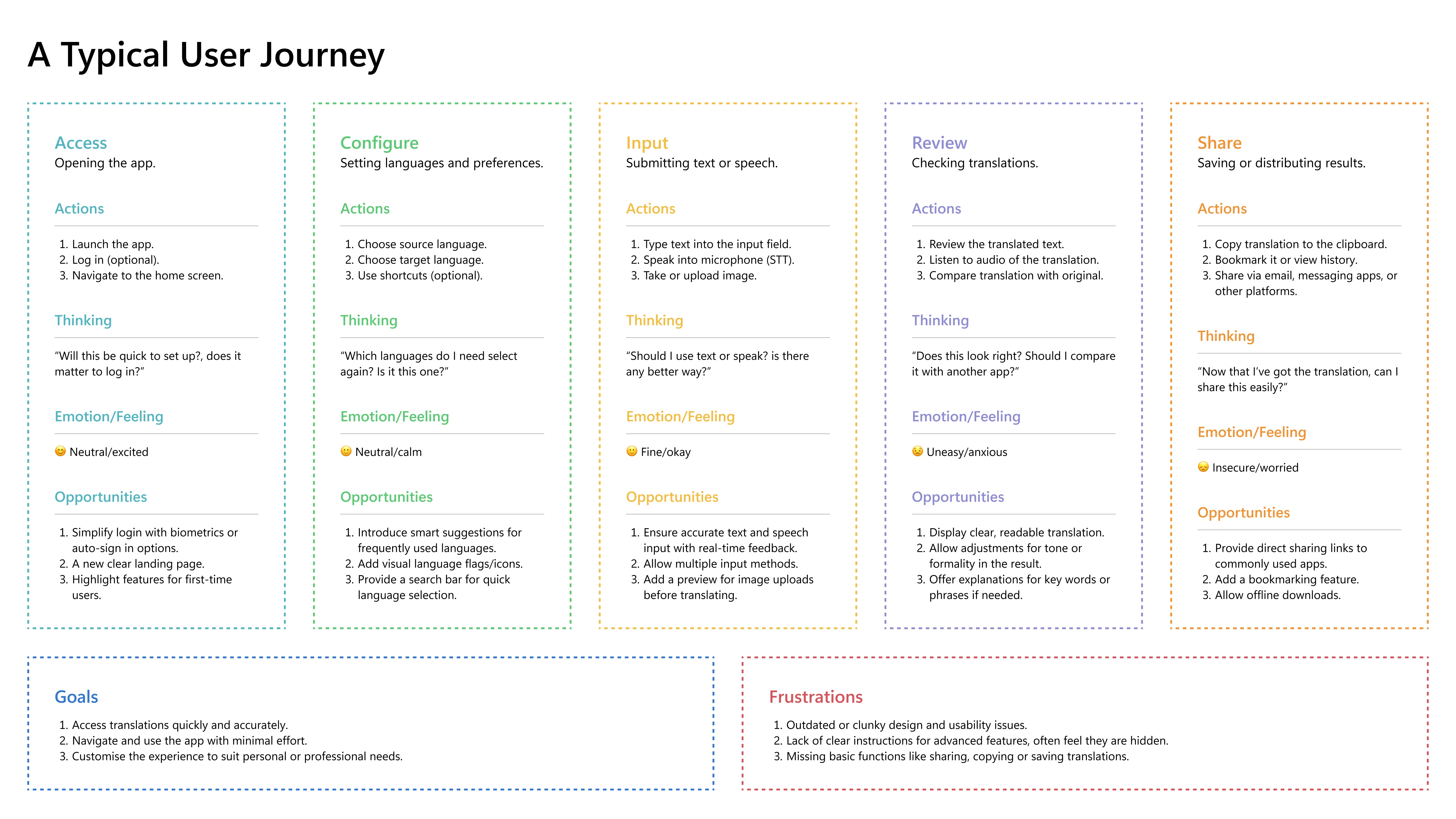
This user journey maps the typical experience of using a translation app when fulfilling certain actions that details key actions, thoughts, emotions, and opportunities at each stage. It also highlights overarching goals and frustrations, that provide insights into areas where design enhancements can improve the user experience.
Identified Opportunities

Site Map
The site map illustrates the user flow of the core functions within the app, including camera, text, and voice translation, along with the live chat feature. It also highlights how users can access and manage saved or previous translations.
Wireframes
User Testing and Feedback
User testing during the redesign process identified specific usability issues, feature expectations, and aesthetic preferences. Feedback highlighted areas for improvement, such as button spacing, operational clarity, and layout adjustments, ensuring the design addressed user needs effectively. This iterative approach provided actionable data to refine functionality, improve accessibility, and align the design with user priorities.
Usability Challenges in Early App Design
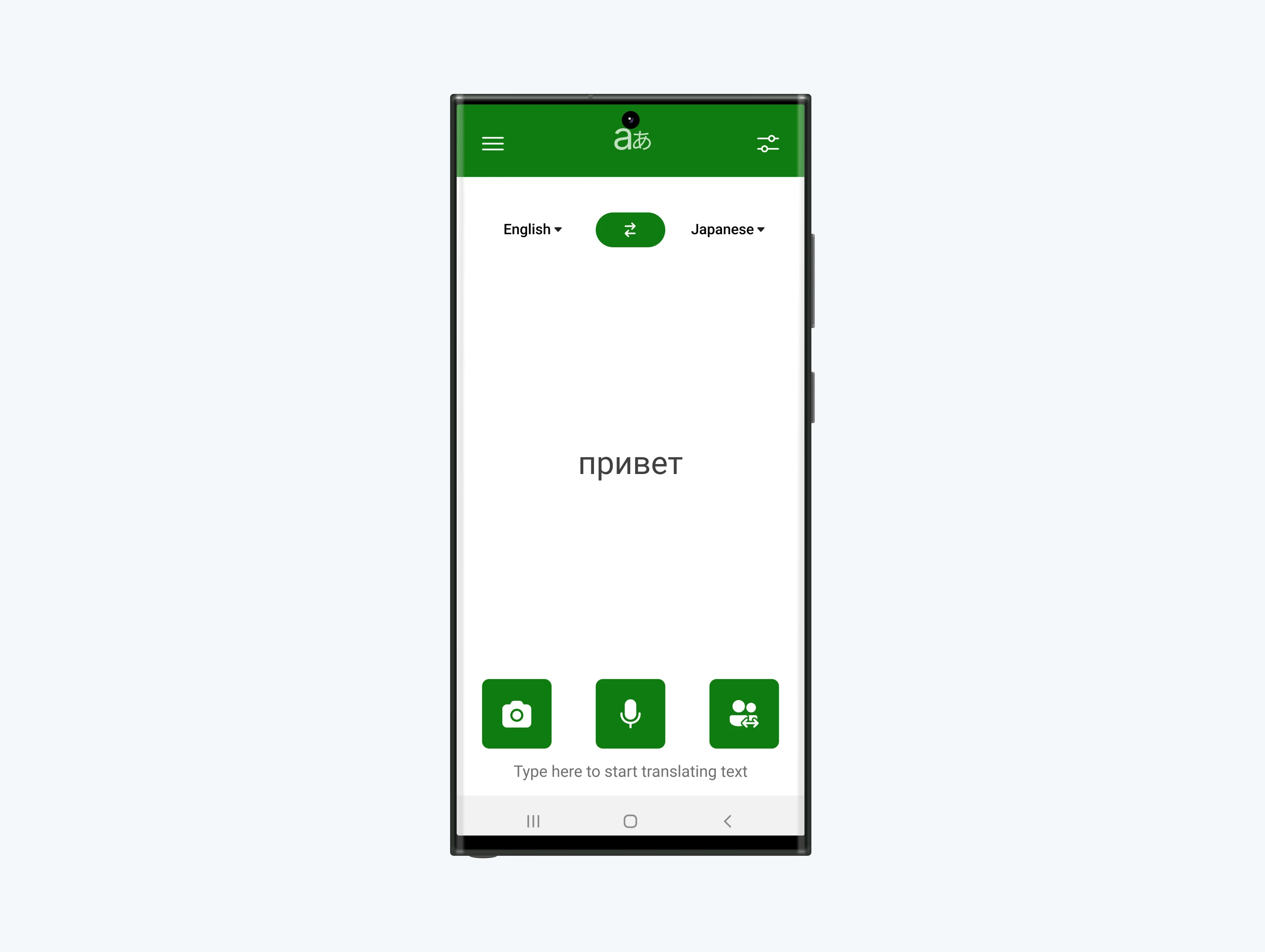
The app initially included four core buttons—Voice, Text, Camera, and Conversation—alongside History and Dictionary buttons in the bottom corners. A blurred sunset and water background added a visual element, but users struggled with unclear functionality and navigation.
Key User Feedback:
App lacked clear guidance on use and navigation.
Language selection options were not visible.
Background visuals distracted from usability,
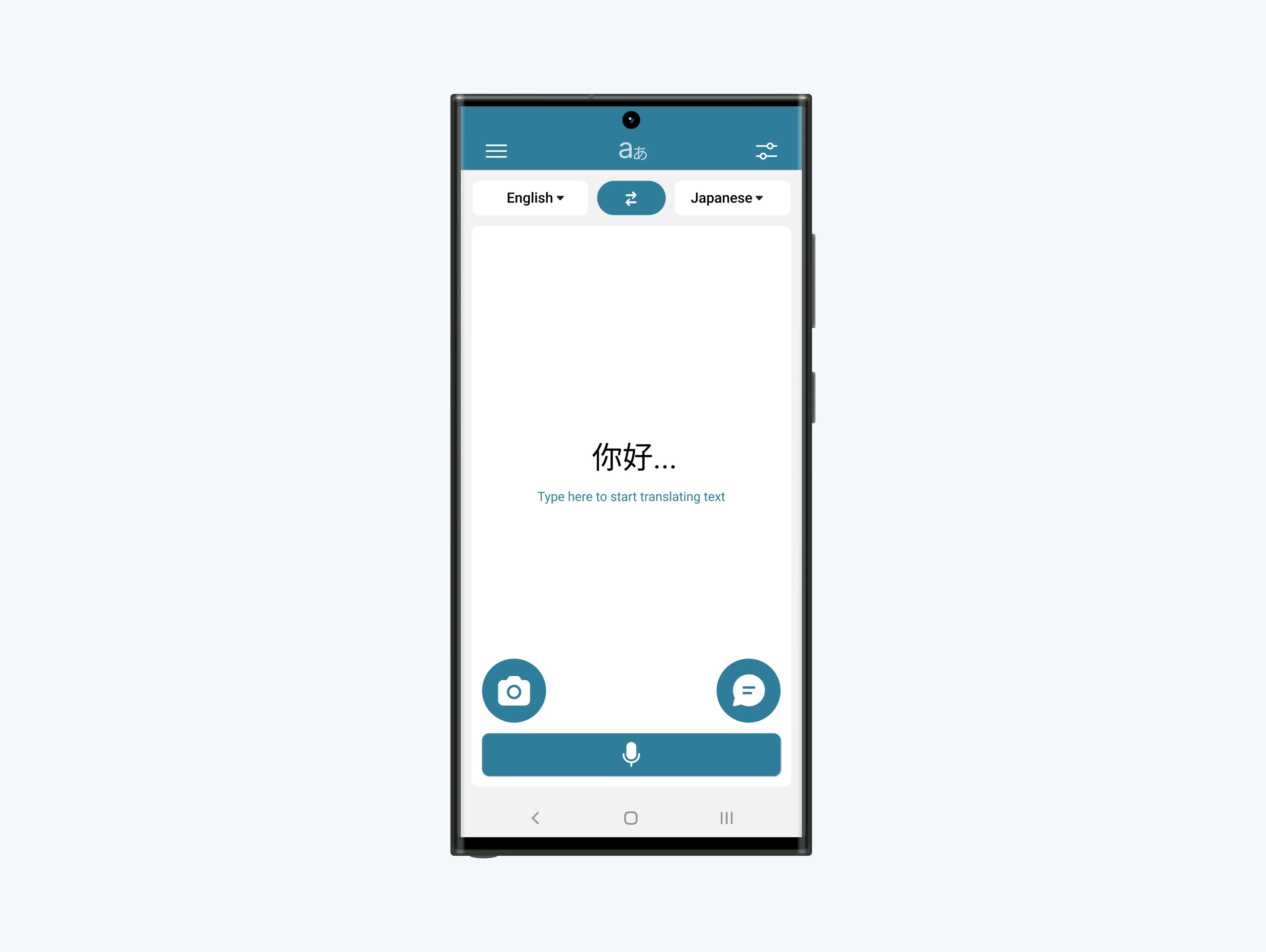
Iteration 1: Branding Integration and Navigation Updates
Existing branding was applied to create a cohesive identity. A dropdown language selector was introduced, consolidating core functions below it, with a side menu and options button added for improved accessibility.
Key User Feedback:
Branding felt overly saturated and detracted from the design.
Dropdown language selectors were unclear and unintuitive.
Side menu was appreciated, but quick access to History and Dictionary features was missed.
Iteration 2: Refining Usability and Visual Balance
Adjustments addressed previous feedback: branding was softened, button spacing improved for better ergonomics, and the language selector was redesigned for clarity. Quick access to History and Dictionary features was reintroduced.
Key User Feedback:
Branding felt overly saturated and detracted from the design.
Dropdown language selectors were unclear and unintuitive.
Side menu was appreciated, but quick access to History and Dictionary features was missed.
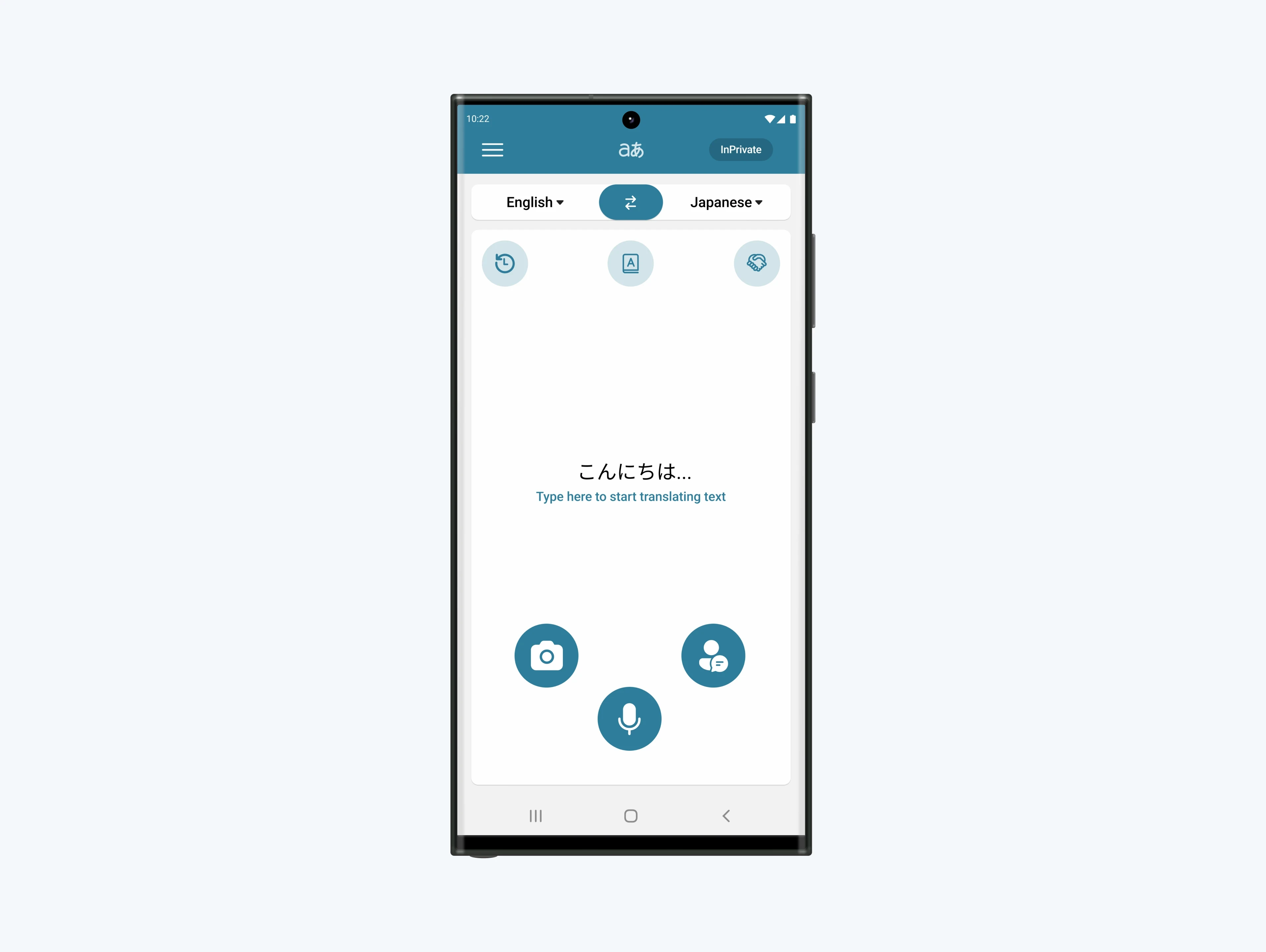
Final Design Phase: User-Centric and Privacy-Focused
The design was refined further to create a cohesive and user-centric layout. Advanced features, such as cultural exploration tools, were added to enhance learning opportunities. A privacy-focused “inPrivate” mode addressed concerns about data recording.
Impact of User Feedback:
Functional and aesthetic adjustments resulted in a polished, user-friendly interface.
Advanced features positioned the app as a valuable tool for deeper linguistic and cultural engagement.
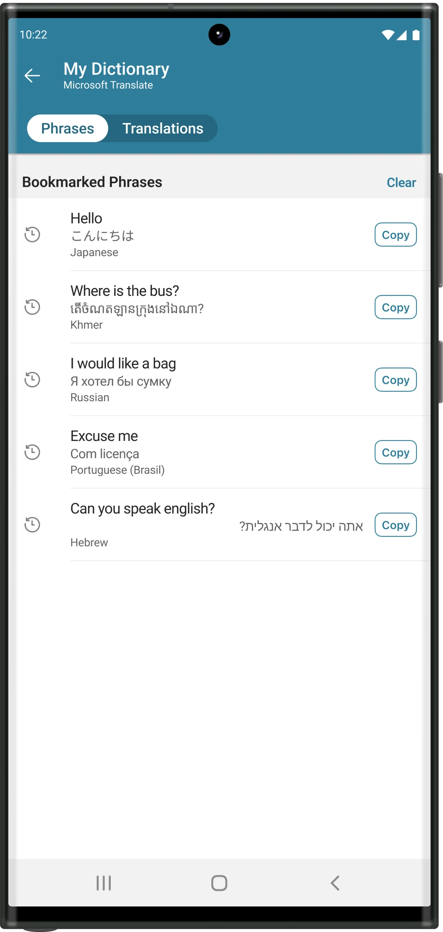
High Fidelity Prototype
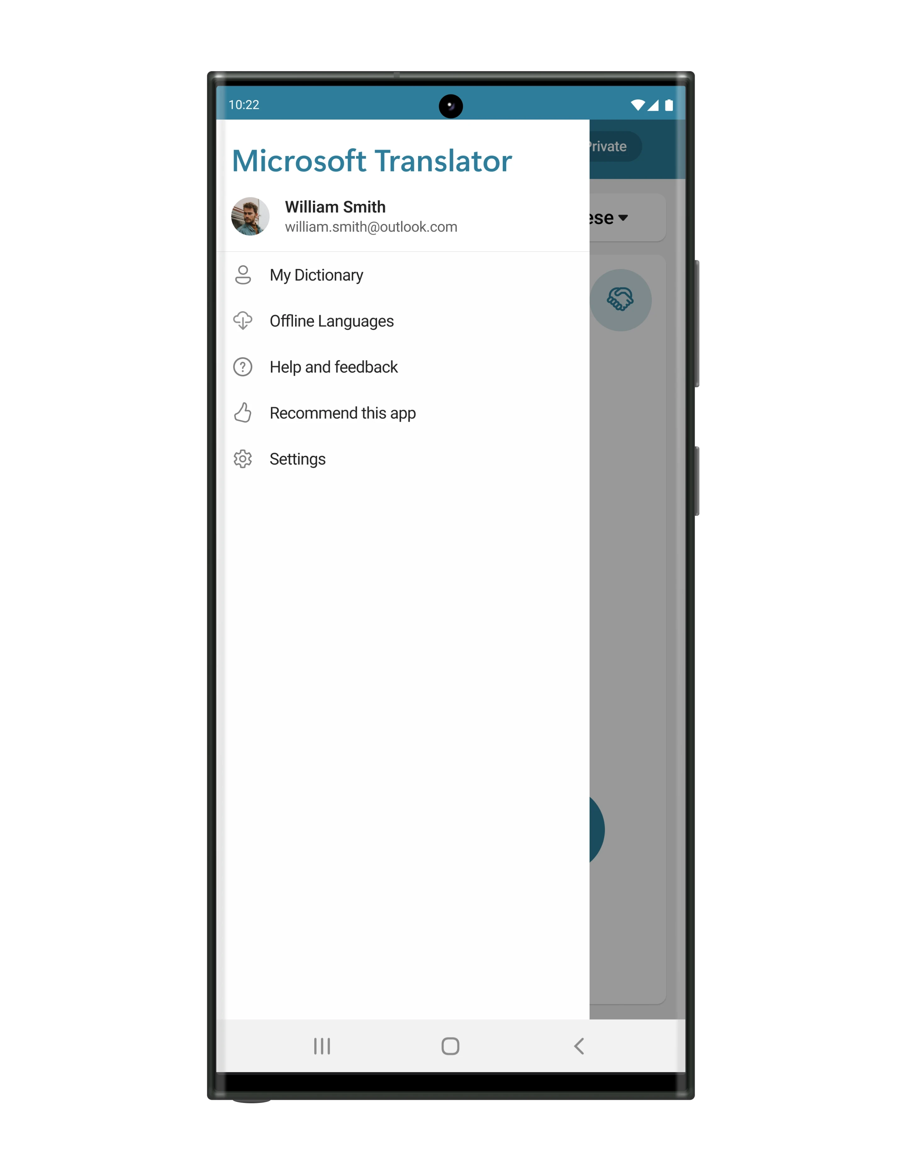
Home
High Fidelity Prototype
During onboarding, users can sign in, create an account, or continue without one. The home page provides access to translation tools, device settings, account management, and offline language downloads. Users can toggle light and dark modes (defaulting to automatic) and enable “inPrivate” mode to prevent saving translation history.
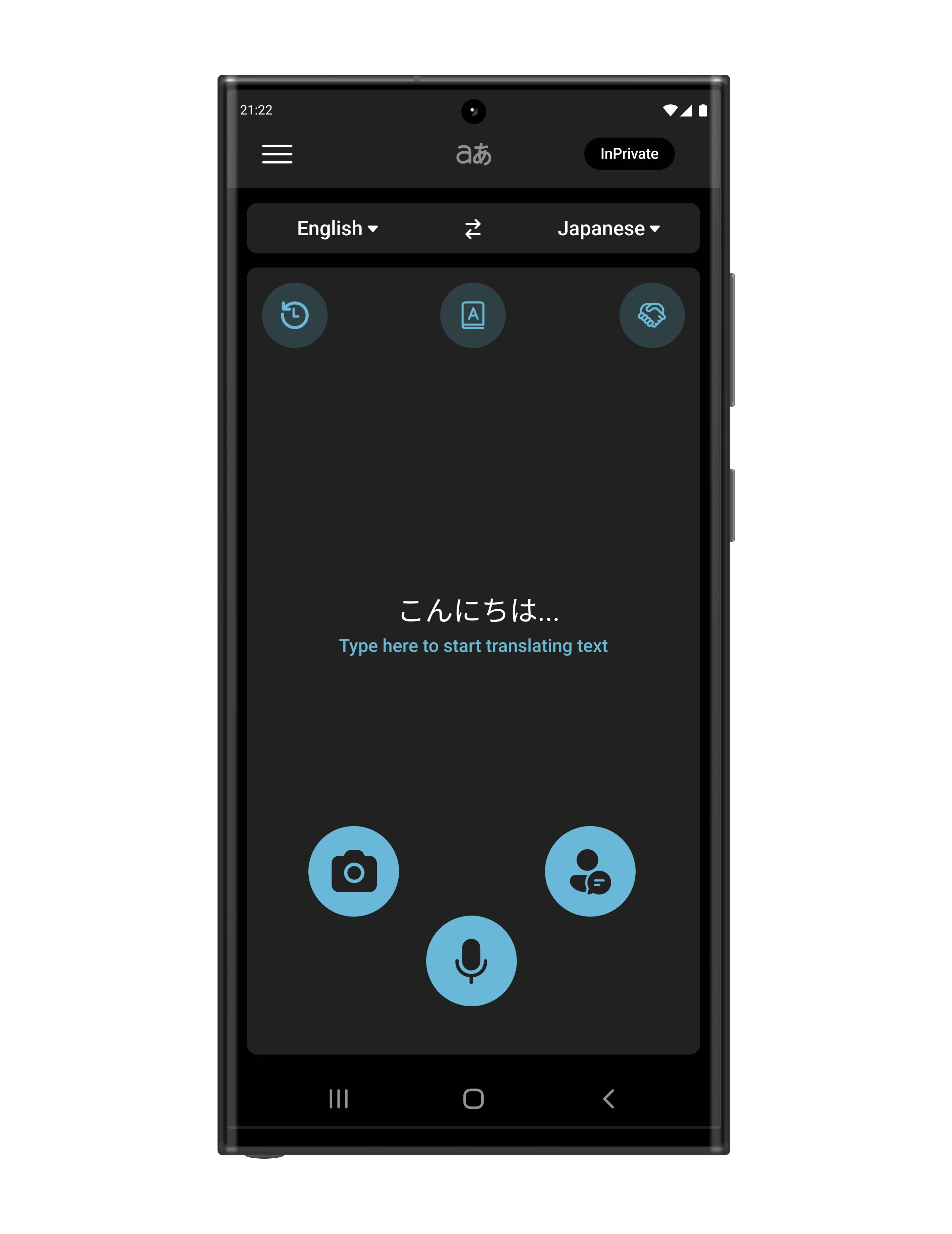
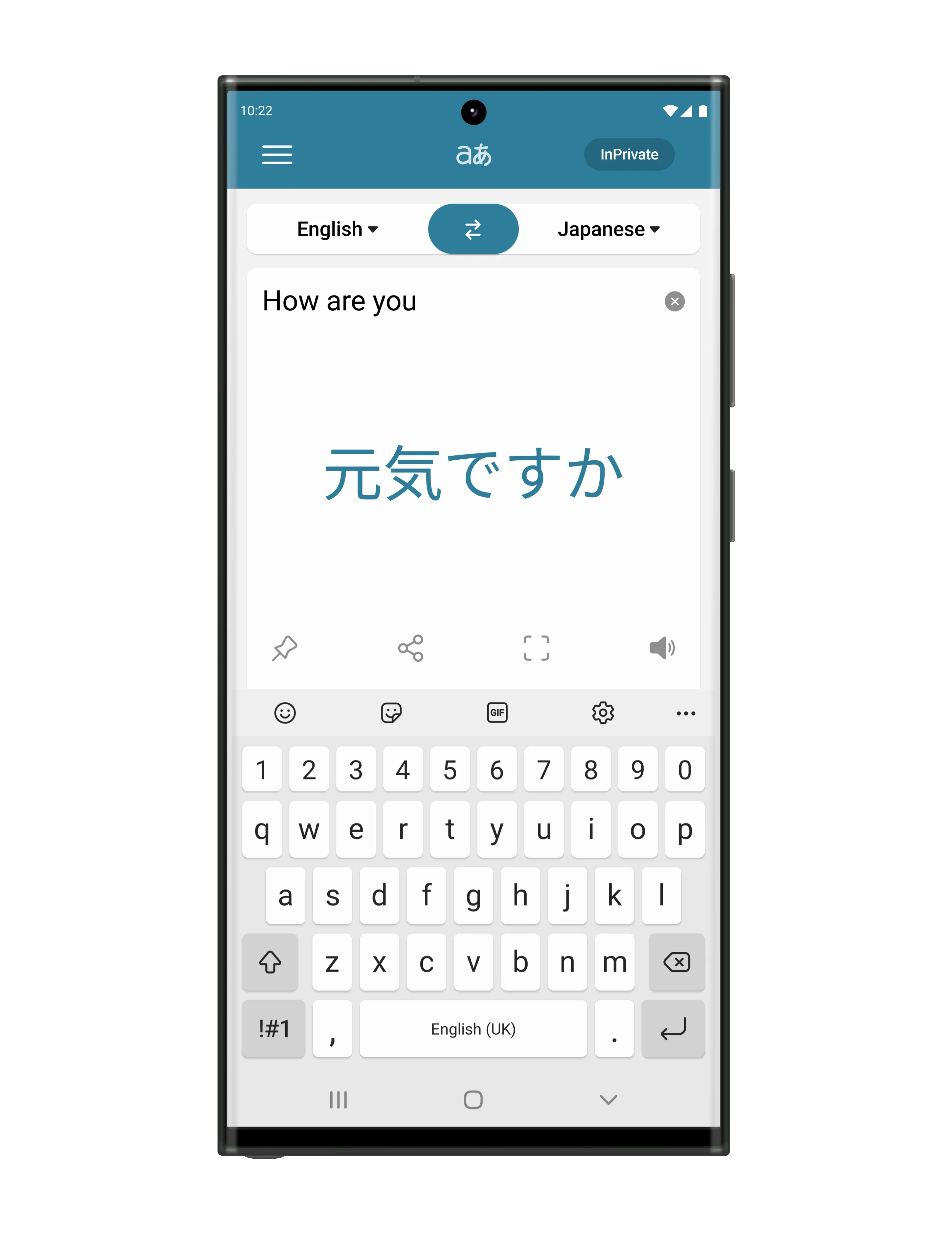
Core Functions
High Fidelity Prototype
Text
Users can carry out traditional text-based translations with ease. Translations can be saved, shared, displayed in full-screen mode, or played aloud to aid pronunciation.
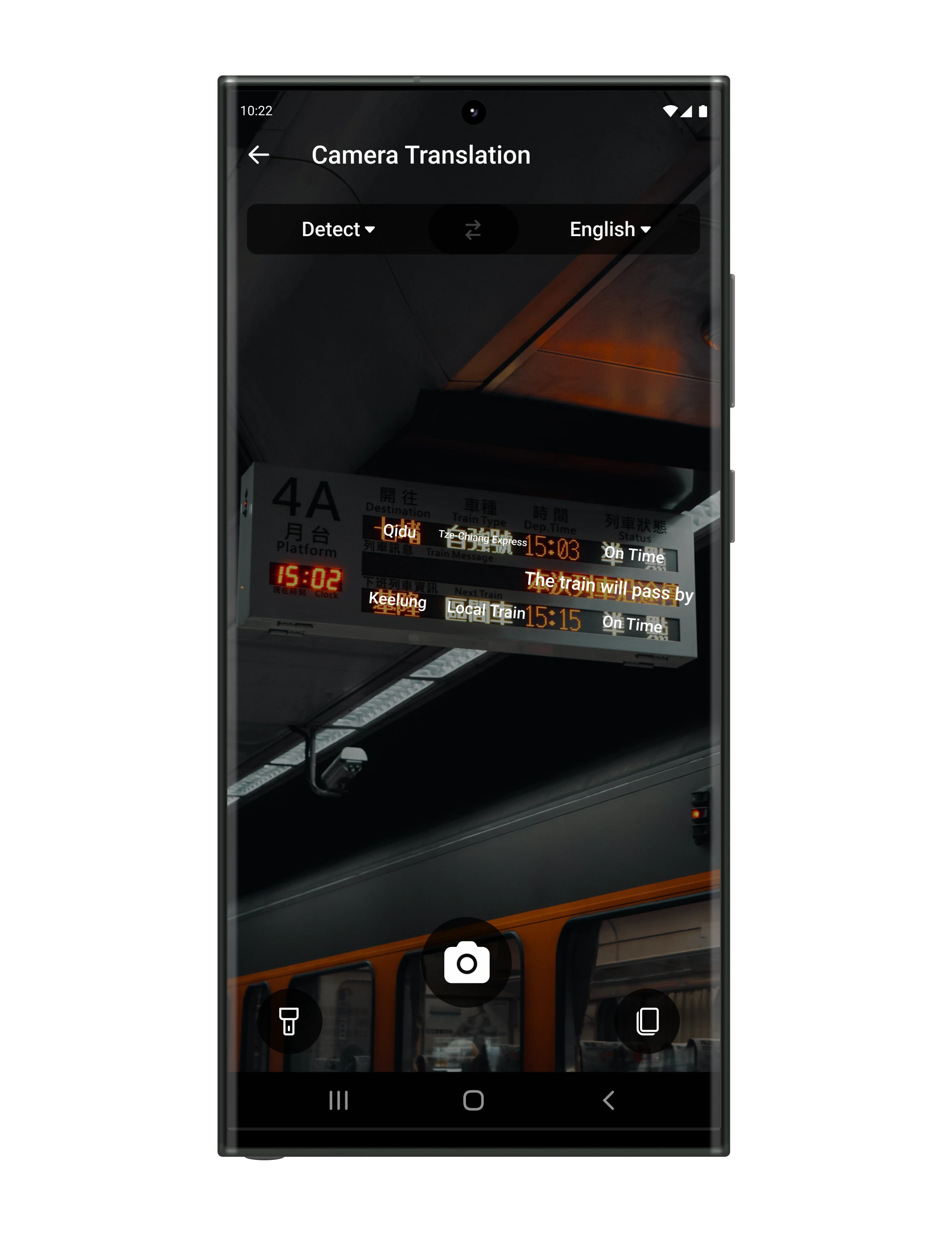
Camera
With the phone’s camera, users can translate real-world text instantly, overlaying the translation on the image. Photos can be captured for static and more precise translations. The app also includes a flashlight option for better visibility and lets users copy any translated text.
Speech
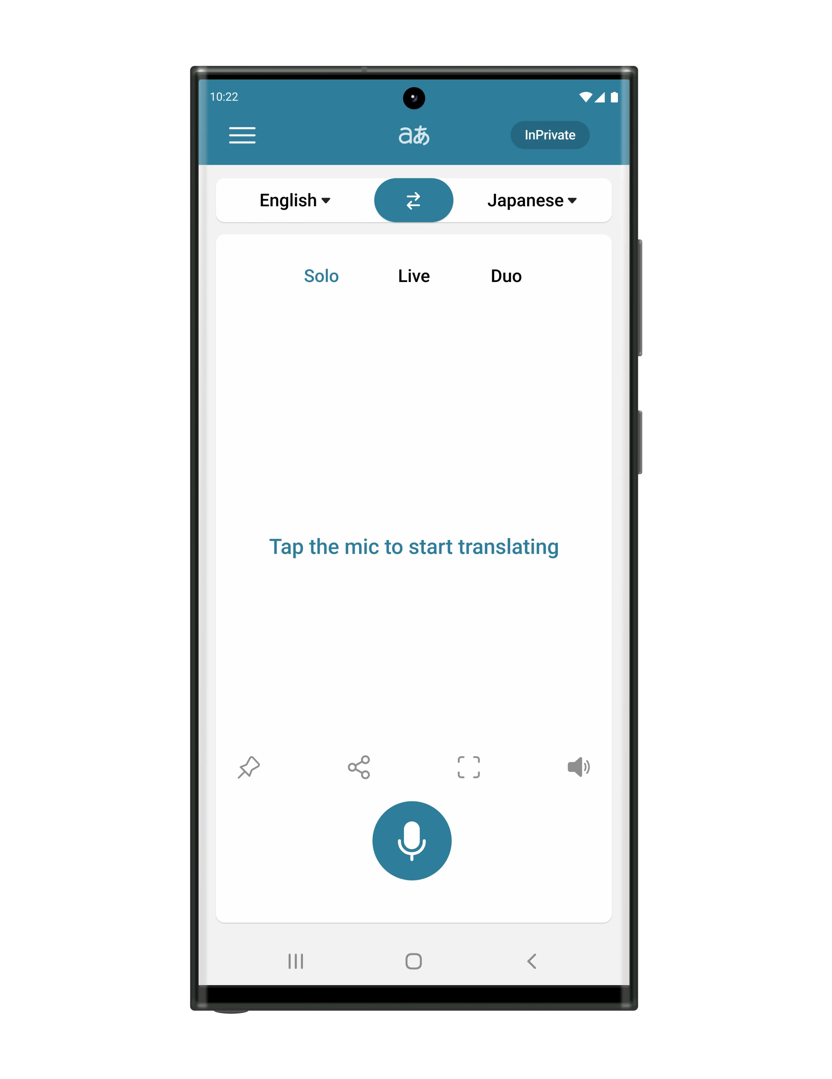
Using voice input, users can receive automatic translations in real time. The app supports single phrases, continuous live translation, or turn-based conversations with automatic language switching—ideal for in-person interactions.
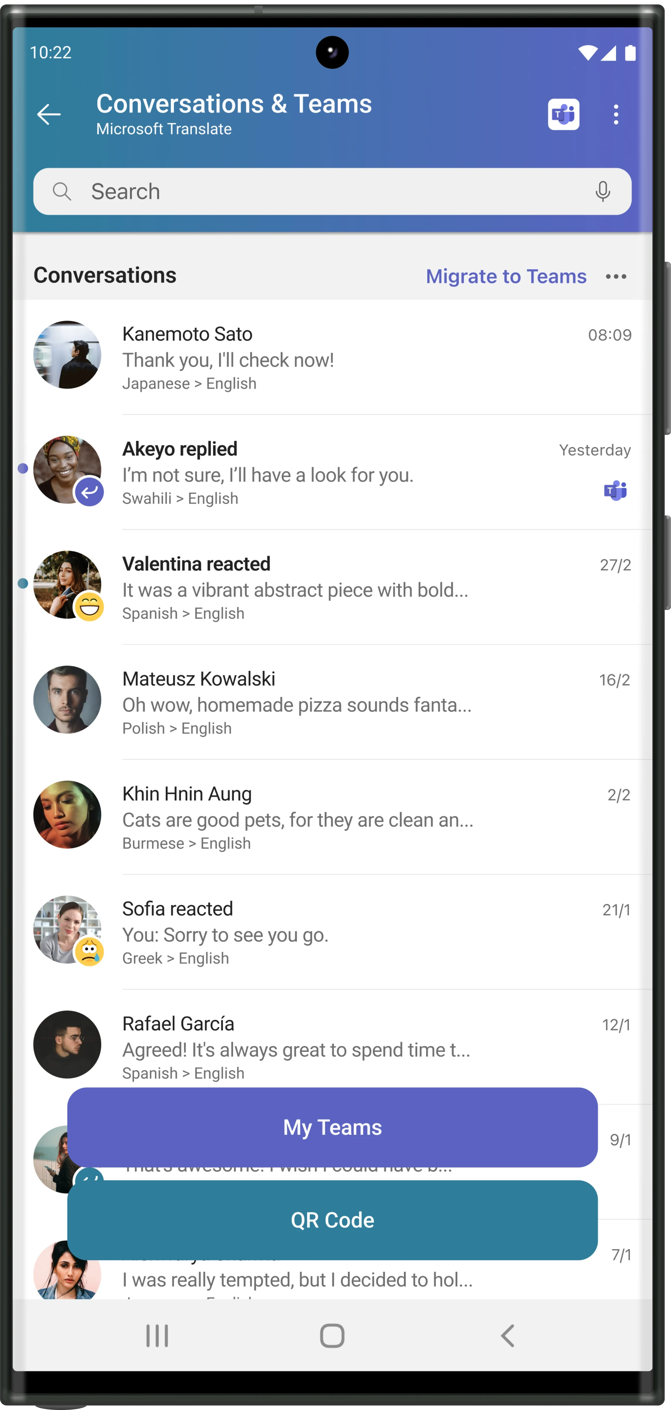
Conversation
High Fidelity Prototype
The Conversation feature enables text-based chats with real-time translation, bridging language barriers effortlessly. Users can manage previous interactions, start new conversations, and share contact information via QR codes, ensuring easy and accessible global communication.
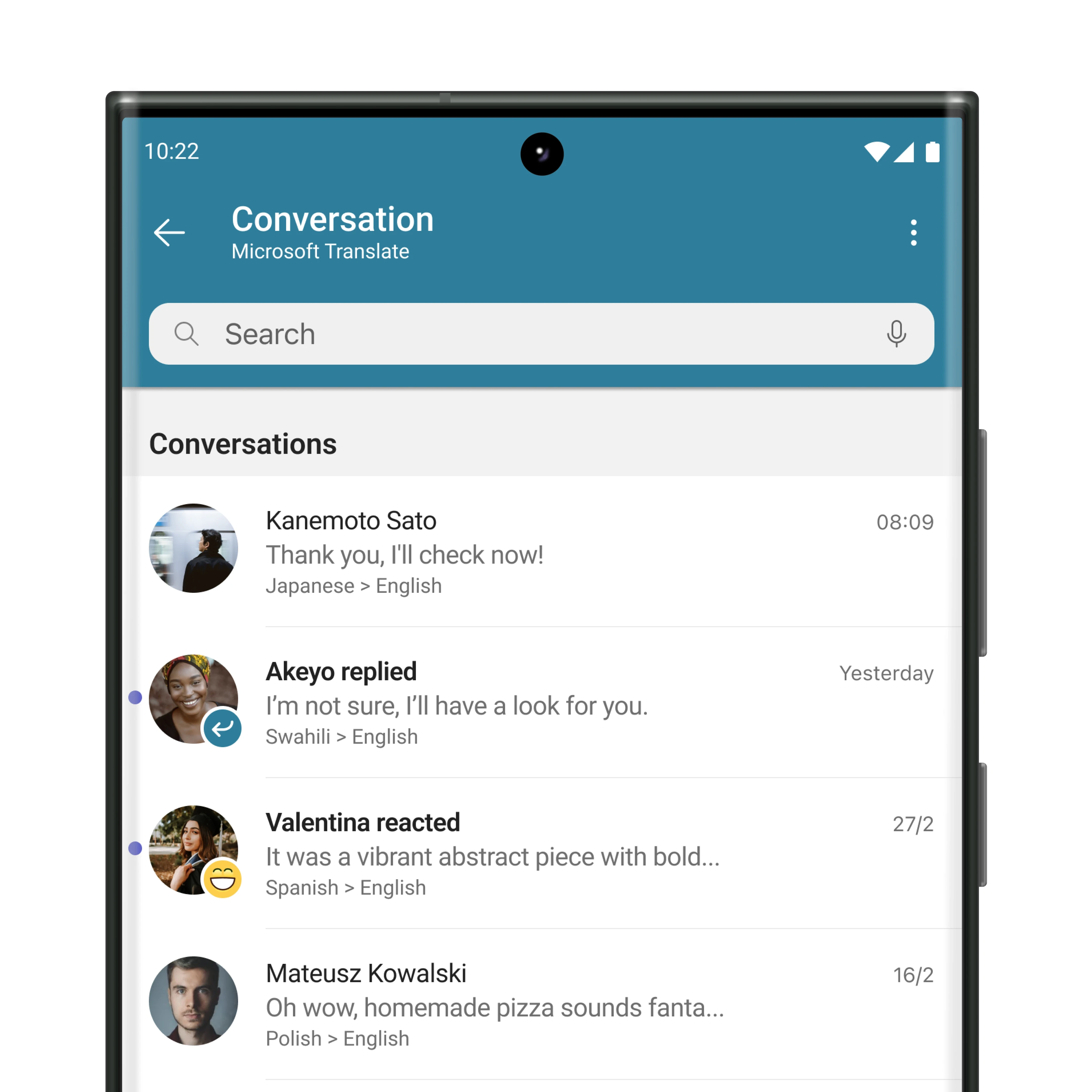
Conversations
Users can view and manage their previous chats, search by text or participants, and check the latest emotion status left by others in each conversation. The page also includes access to the user’s personal QR code for quick and easy sharing.
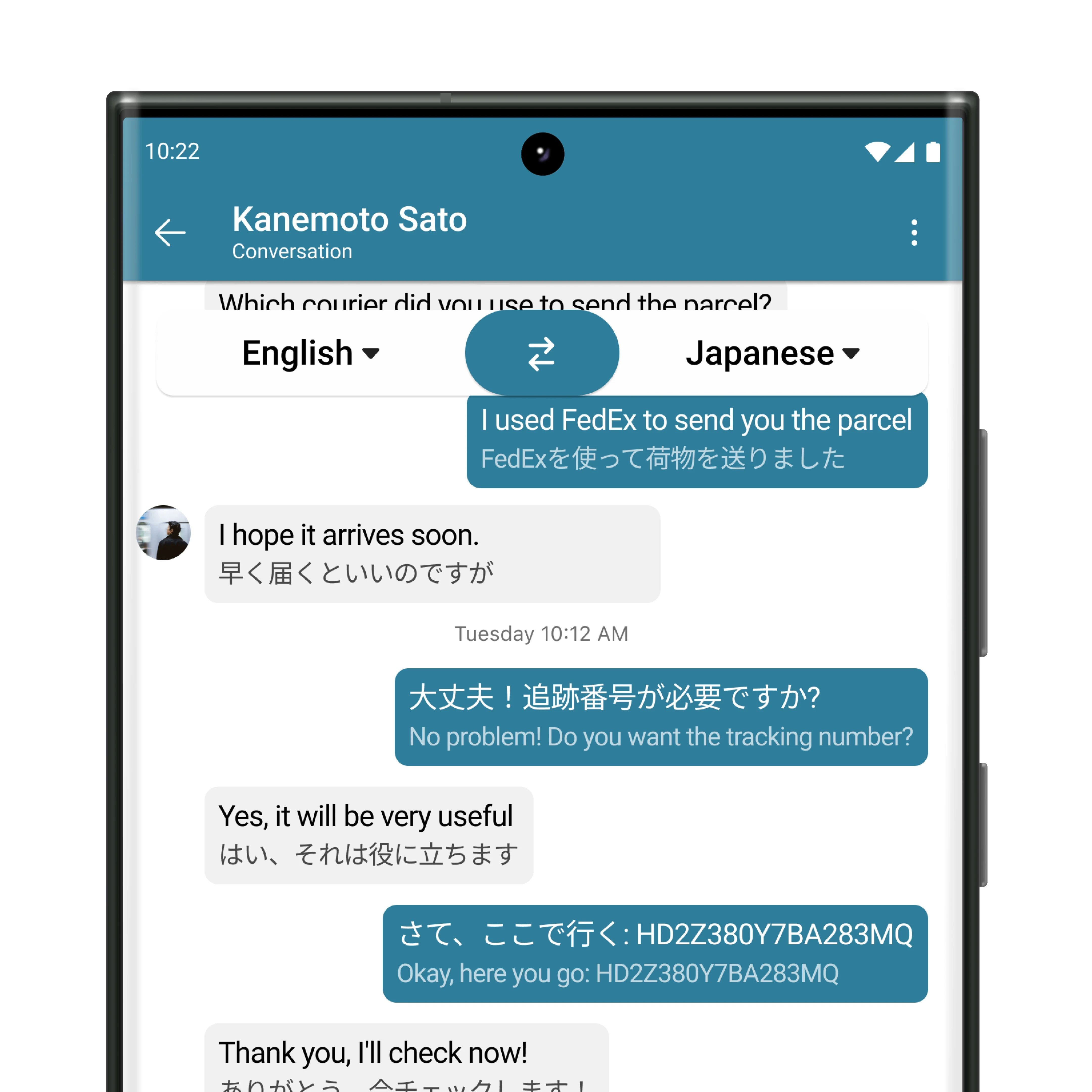
Chat
The chat feature operates like a standard messaging app but includes automatic and manual translation options. Users can send and receive messages in any language, enabling smooth, multilingual communication.
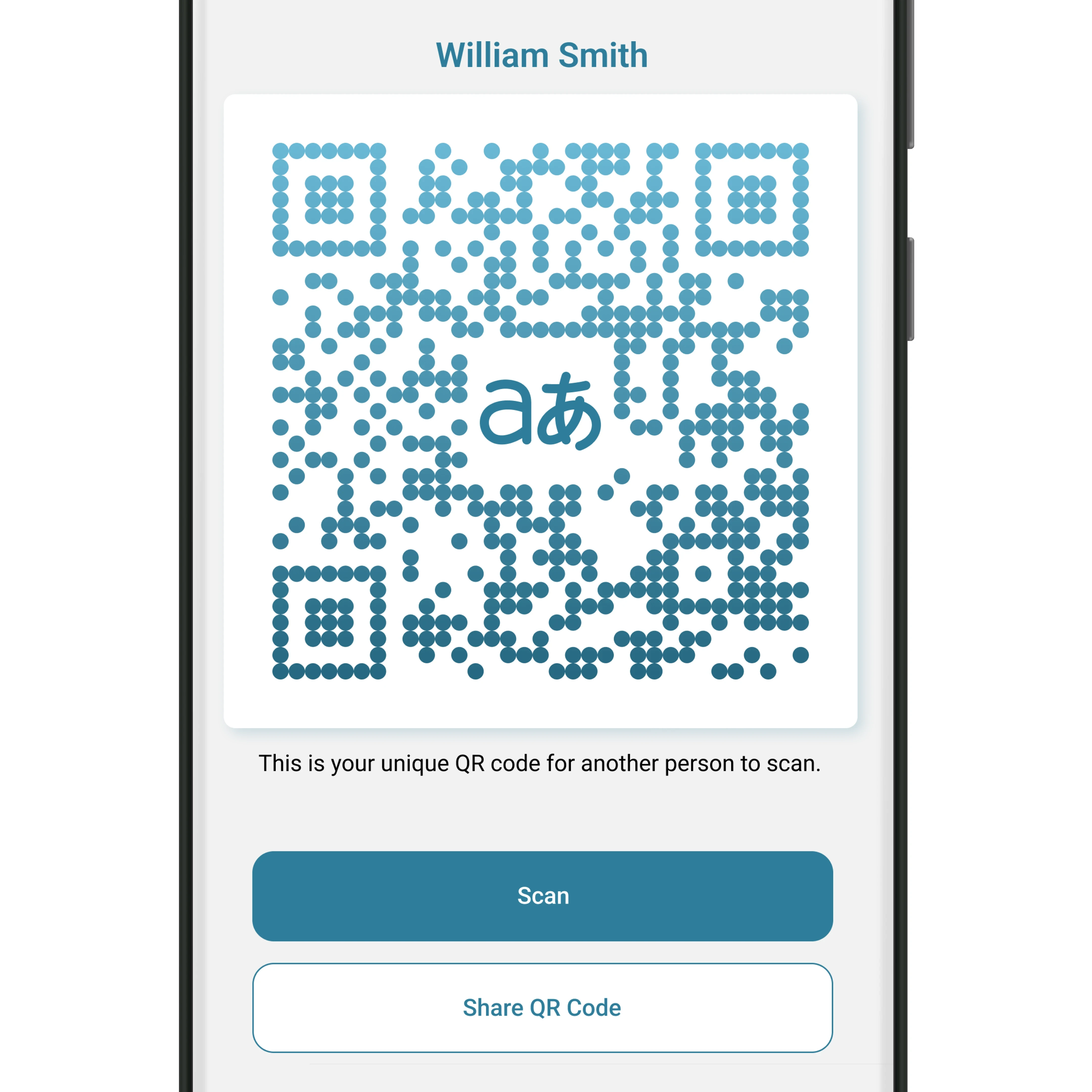
Share
Users can share their QR code for others to connect. This can be achieved by displaying the QR code for scanning, using the camera to scan another code, adding a photo of a QR code, or sharing the code through the device’s sharing menu.
Design System
As a Microsoft product, the redesign exclusively utilised the Microsoft Fluent Design System. Both the newer Microsoft Fluent 2 iOS (Community) and the older Microsoft Fluent Android (Community) were used in Figma. The Android version had not been updated on Figma for over two years at the time of redesigning, while the iOS version was regularly updated. The product centred around the Android version due to personal access to devices at the time for prototype testing.


Microsoft Teams
Intergration
Post Project Feature
After the original design phase, new ideas emerged to integrate Translator with both the mobile and desktop Teams applications. This concept was inspired by insights identified during the earlier persona discovery stage.
Project Thoughts
Building on the foundation of the TRAC Mobility projects, the challenge lay in balancing a familiar design system with the unique requirements of a vastly different product. Working independently helped refine my skills in combining functional UX design with aesthetics, solving complex design problems, and addressing diverse user needs.
Previous
Next