Introduction
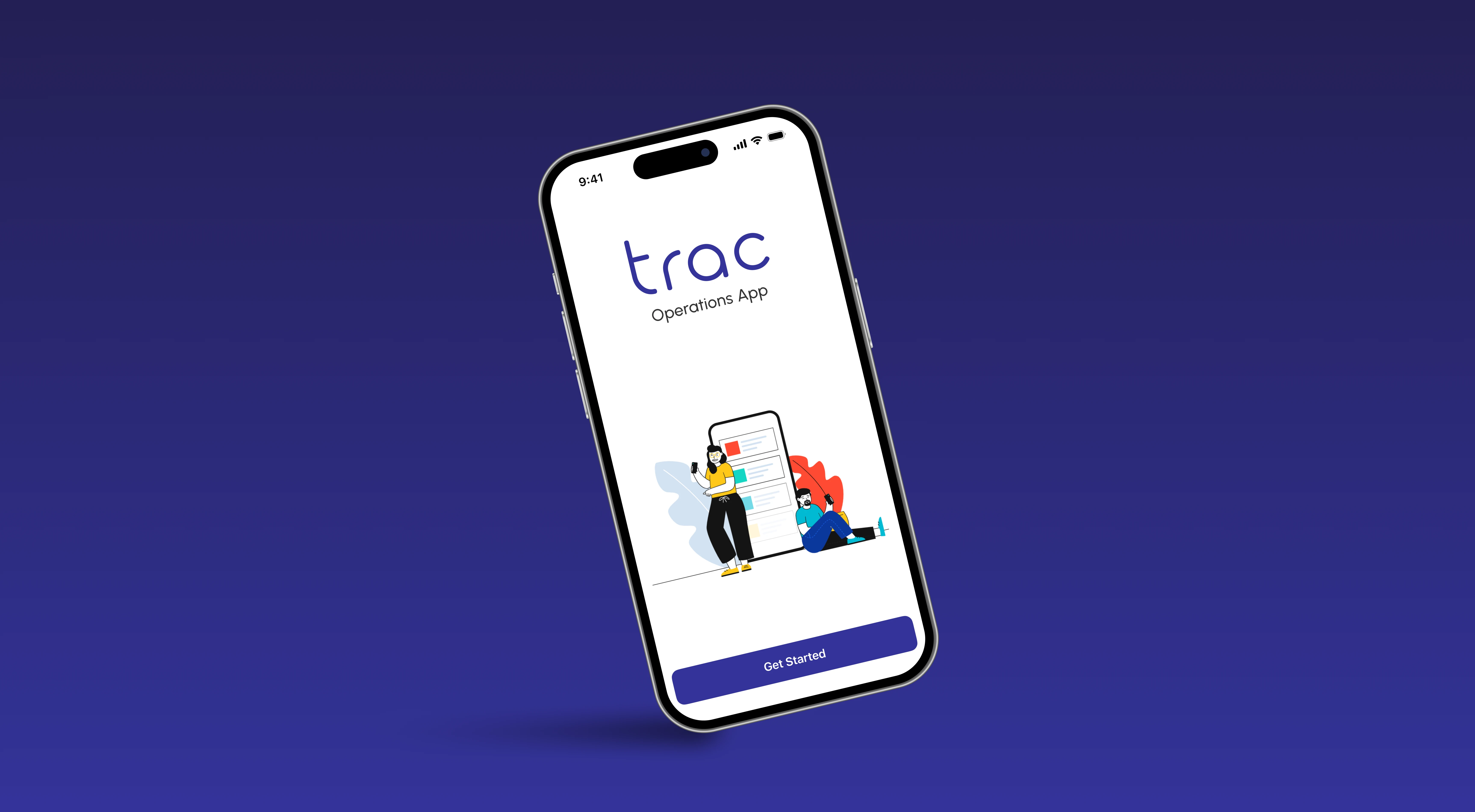
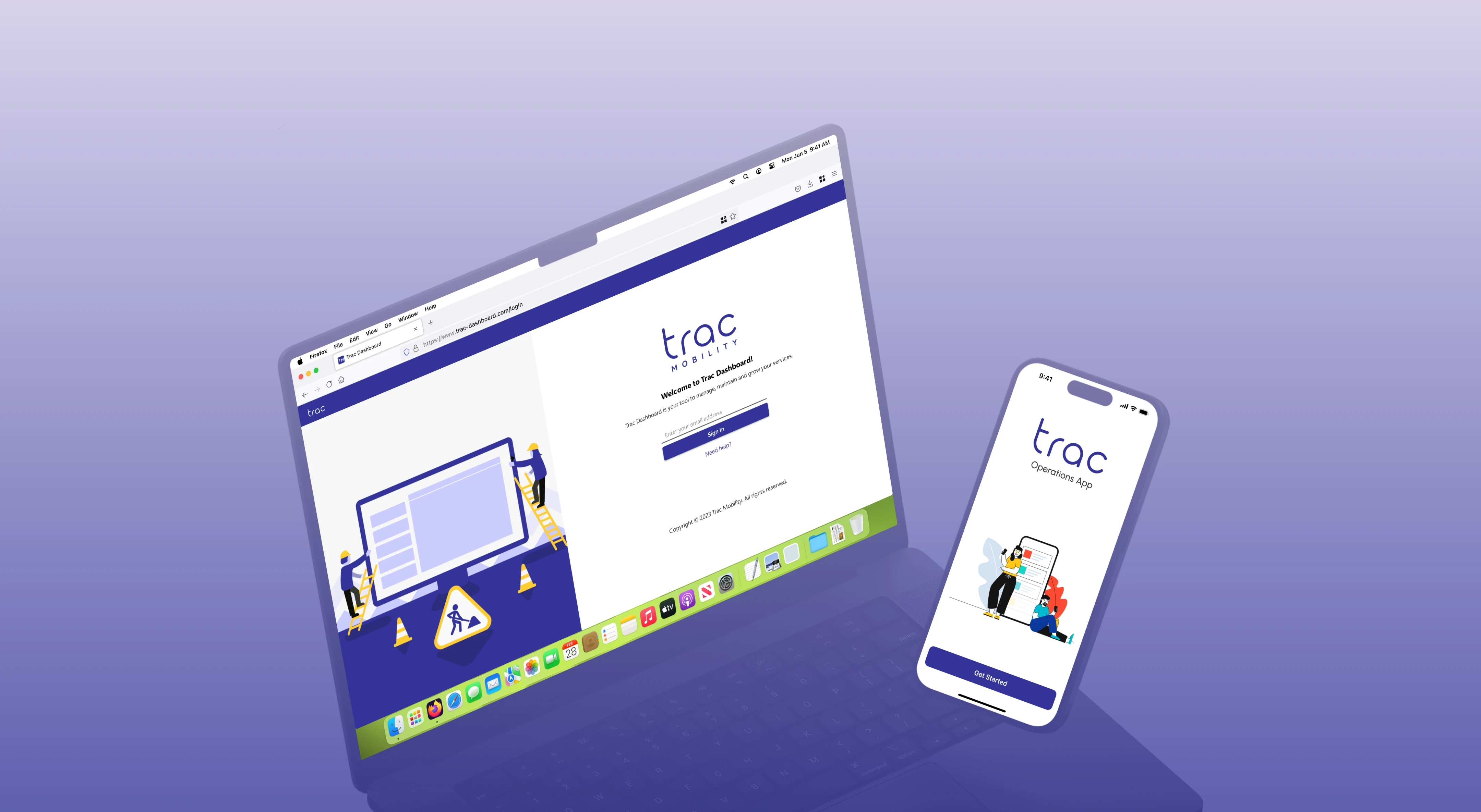
The TRAC Dashboard evolved from an initial proof of concept into a comprehensive B2B platform for managing micromobility services and fleets. Built with Microsoft’s Fluent Design system, it serves as an all-in-one hub, integrating team management, inventory, customer services, data analytics, marketing, and a store where businesses can supply and purchase items for their fleet. Designed to be scalable and adaptable for future growth, as the needs of micromobility providers evolve.
Stakeholder
Location

Problem Space
The TRAC Dashboard focuses on addressing the inefficiencies and complexities in managing micromobility services and fleets. Many businesses in the micromobility sector face challenges in centralising and streamlining their operations, often relying on multiple disconnected systems and tools. This fragmentation leads to difficulties in tracking fleet performance, managing inventory, monitoring customer service, and executing marketing efforts effectively. Due to the complexity of the product, businesses will need to rely heavily on customer support, making fleet management and customer service core to ensuring smooth operations. Additionally, the lack of scalability in existing solutions makes it harder for businesses to adapt and grow as their needs evolve. TRAC Mobility aimed to solve these problems by offering an integrated, user-friendly platform that centralises all key functions into one cohesive, scalable system designed for future expansion.
Secondary Research of Micromobility Platforms
The global micromobility market is projected to more than double between 2022 and 2030, growing from approximately $175 billion USD in 2022 to over $400 billion USD by 2030.
Statista
Shared Micromobility Ridership
In 2022, riders in the U.S. and Canada took a total of 130 million trips on shared bikes and e-scooters, with 113 million trips in the U.S. and 17 million in Canada
NACTO
European Market Growth
In 2022, Europe accounted for approximately $60 billion of the global micromobility market, with projections indicating growth to $140 billion by 2030, representing a compound annual growth rate (CAGR) of over 12%
Zag Daily
Industry Size and Growth Rate
In 2021, the micro-mobility industry was valued at $21.43 billion USD, with an expected compound annual growth rate (CAGR) of 13.9% from 2022 to 2030.
Source
colleague INTERVIEW Extracts
Speaking with 7 colleagues familiar with the existing dashboard, I aimed to uncover their struggles, common tasks, and goals. These discussions helped identify key pain points and the features needed for more efficient workflows. Additionally, regular feedback from clients provided valuable insights into areas for improvement.
User Interface Complexity
Actions
Users often struggle to navigate through multiple sections of the dashboard.
Desire
A more streamlined and intuitive UI, reducing the number of steps to accomplish tasks
Pain Points
Overwhelming, basic and poorly designed interface; users can’t find necessary information quickly.
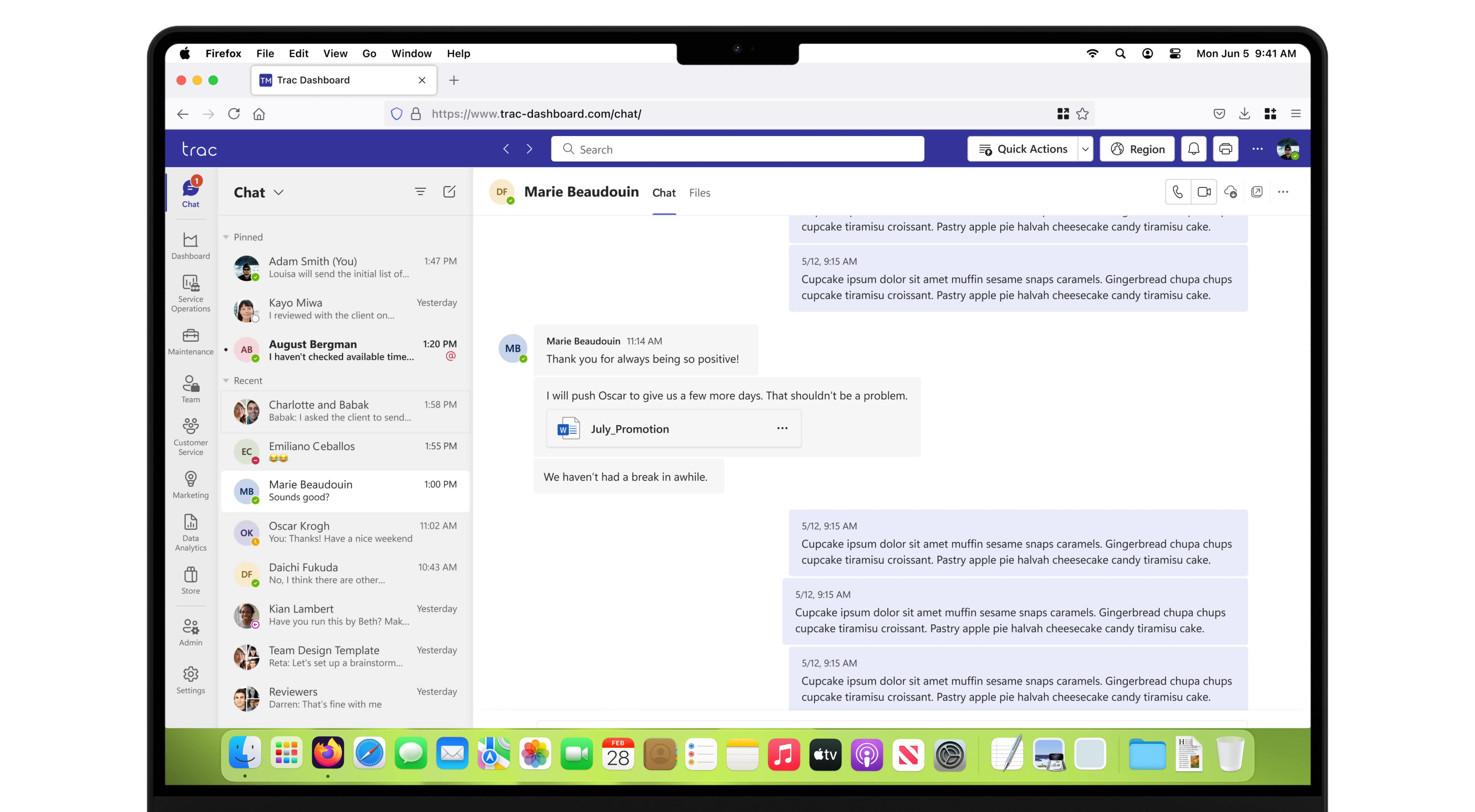
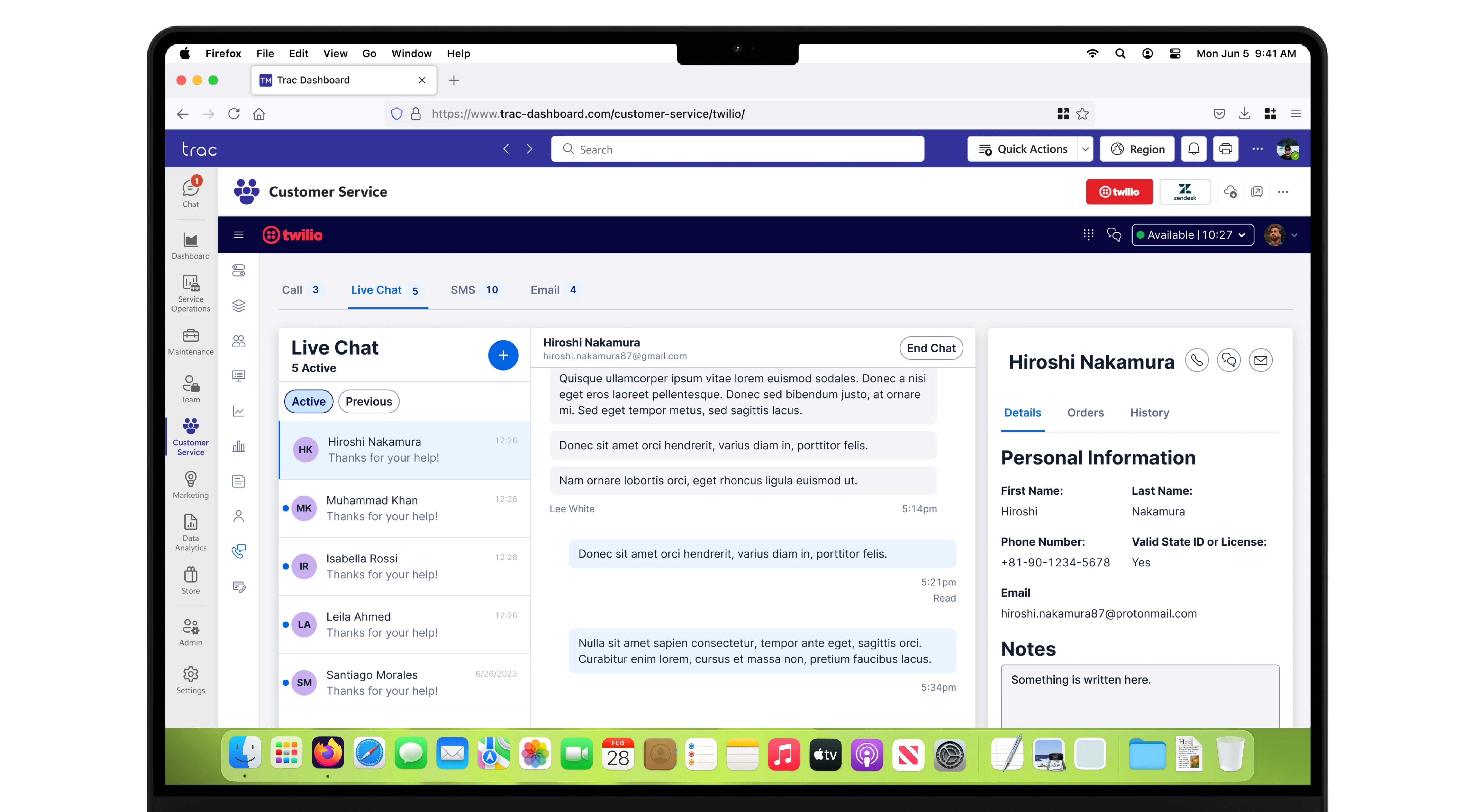
Customer Support & Service Management
Actions
Customers frequently contact phone support for troubleshooting and clarifications, making customer service a core service.
Desire
An easier way to address customer issues directly from the dashboard with quick access to resources and live chat.
Pain Points
Delayed response times or disjointed customer support flow that slows down resolution.
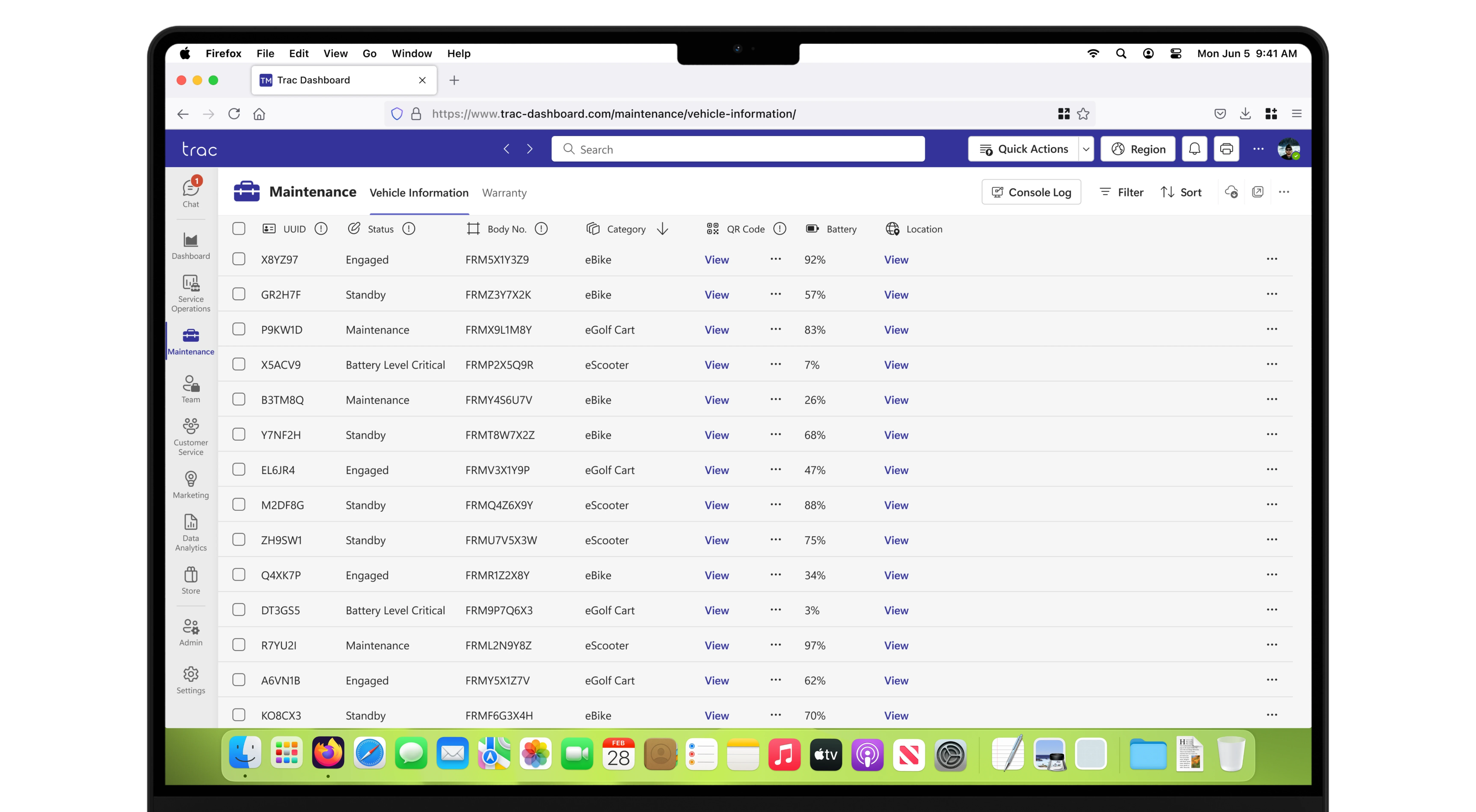
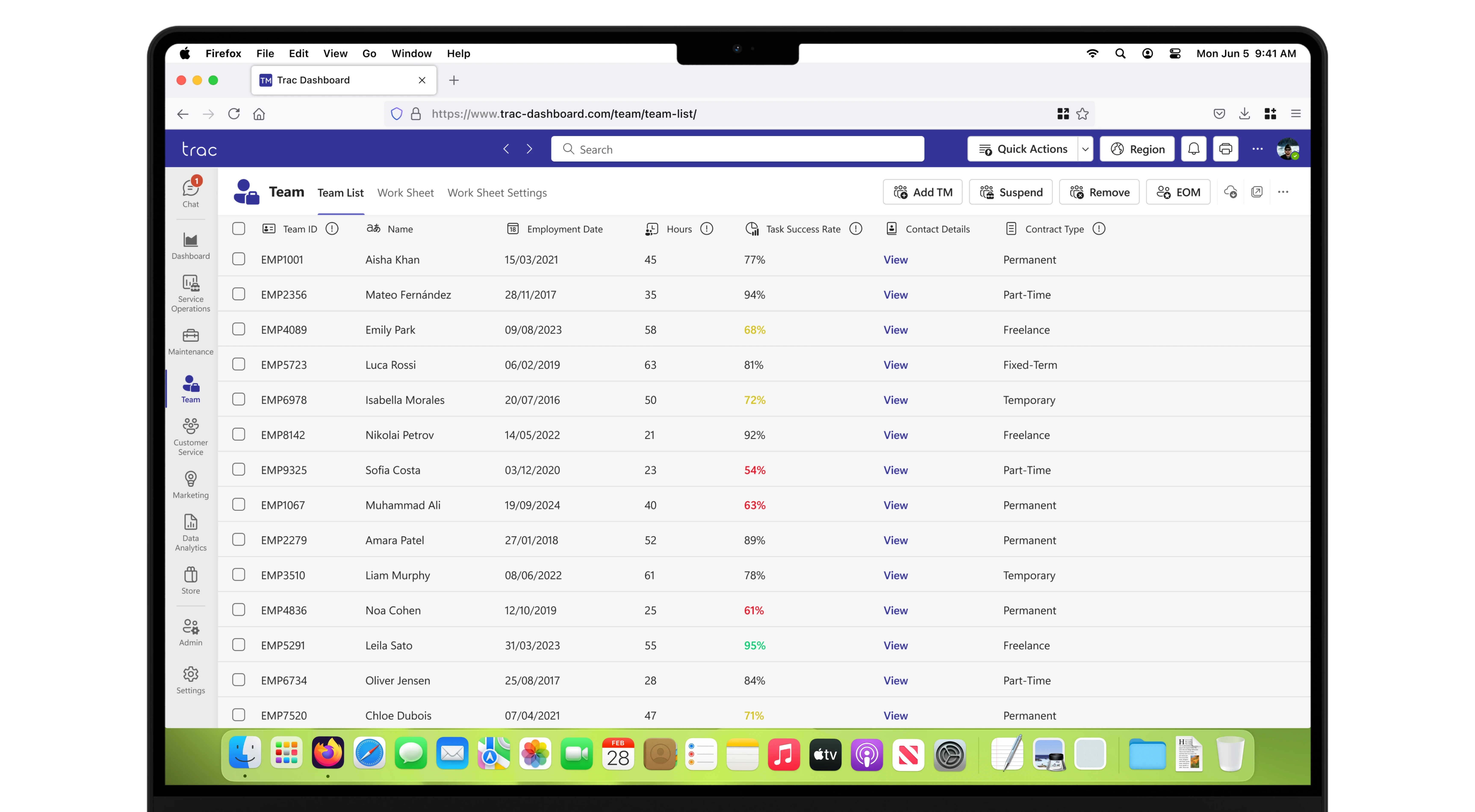
Fleet Management Efficiency
Actions
Fleet managers need to monitor fleet health and usage in real-time.
Desire
Dedicated real-time insights into fleet status, health, and predictive maintenance alerts.
Pain Points
Lack of real-time data on fleet status, and difficulty in tracking fleet maintenance and performance.
Inventory Management & Procurement
Actions
Managers have to manually track fleet parts and items for maintenance
Desire
An automated inventory system with easy access to stock levels, purchase orders, and procurement.
Pain Points
Difficulty in managing inventory efficiently, causing delays in service and repairs.
No Mobile Access
Actions
Clients often need to access the dashboard on-the-go to manage the fleet but there is no mobile experience or app.
Desire
A seamless, mobile-optimised dashboard for remote access to fleet data and management tasks.
Pain Points
There being no mobile version or dedicated mobile app for on-the-go fleet management.
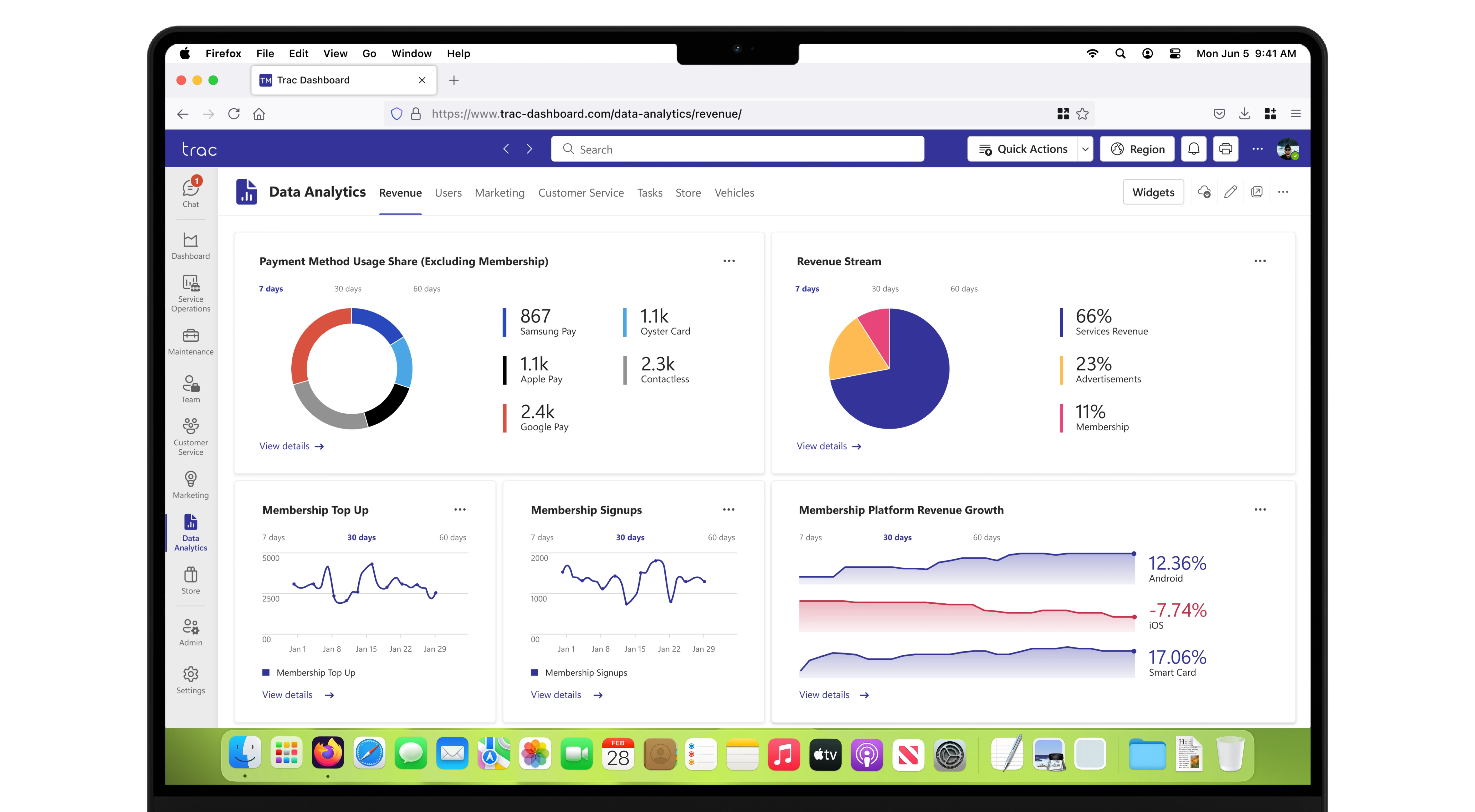
Data Analytics and Reporting
Actions
Users struggle to generate any insights from data easily.
Desire
Advanced reporting tools that offer customisable, easy-to-read reports.
Pain Points
The reporting tools are very basic, often lacking the ability to generate custom or actionable insights.
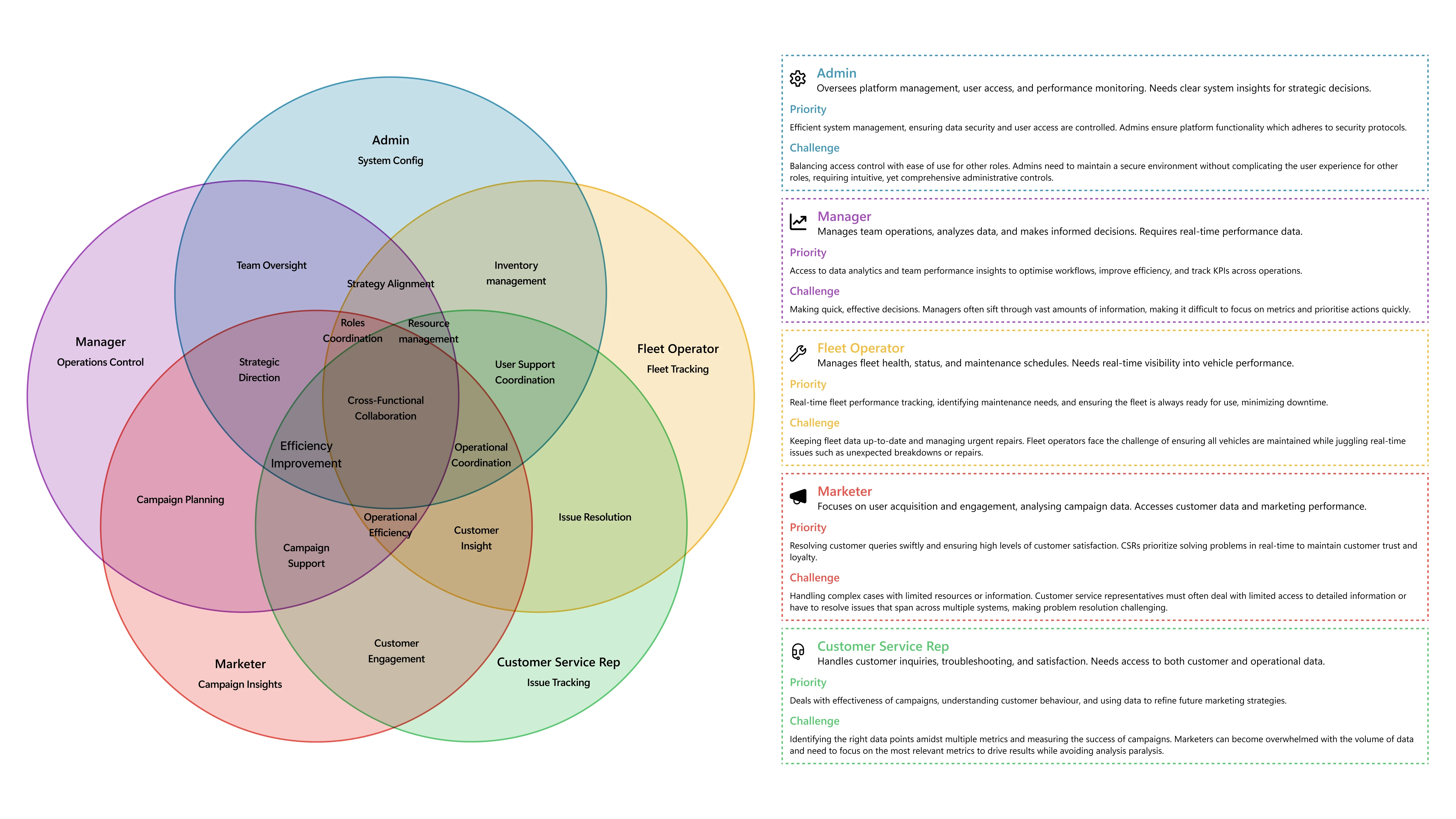
Role Relationships
Illustrating the five primary roles highlights shared responsibilities, interactions, unique needs, and commonalities, guiding design by identifying pain points and opportunities. the dashboard design aims to address both individual and collective needs.
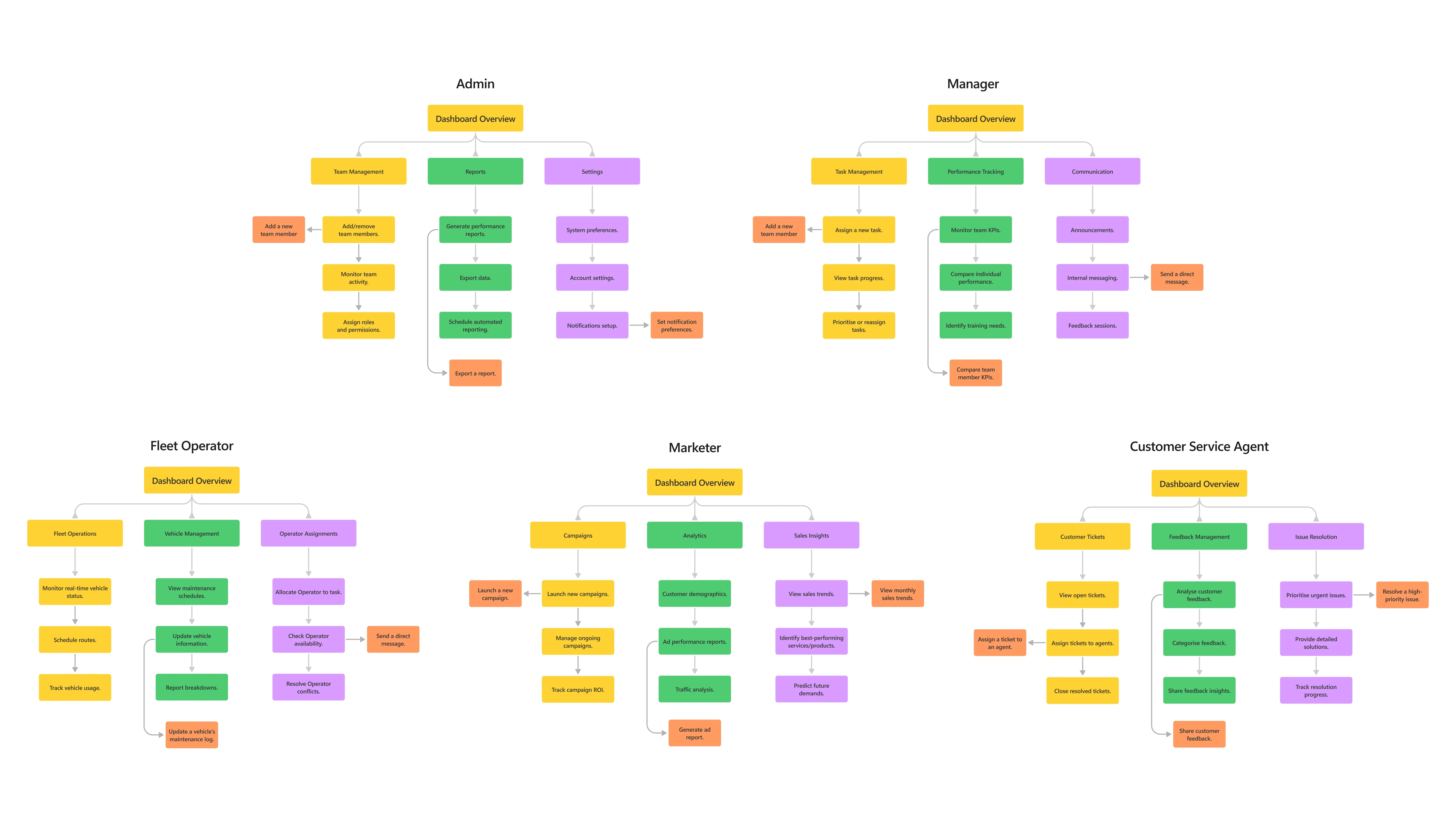
Role-Specific Navigation Map
This map outlines the hierarchical structure of the dashboard’s features, tailored to the distinct desired needs of each user role. By breaking down the primary, secondary, tertiary, and quaternary layers. By analysing the logical flow of tasks and interactions within the platform, workflows and task priorities, gaps and overlaps can be identified.
ORiginal vs Refresh
This side-by-side view highlights the dashboard’s evolution from its original design (2021–2022) to the personal refresh (2023). The original, created in Adobe XD with community-sourced Fluent resources, met basic requirements but had design limitations. The refreshed version, built in Figma with official Fluent 2 Web assets, enhances layout, accessibility, and user experience, fully aligning with Fluent Design principles.
This comparison showcases the shift from meeting project basics to refining the design with updated tools, skills, and a user-focused approach. Navigation was streamlined, merging related pages and improving context for a more functional and intuitive interface.
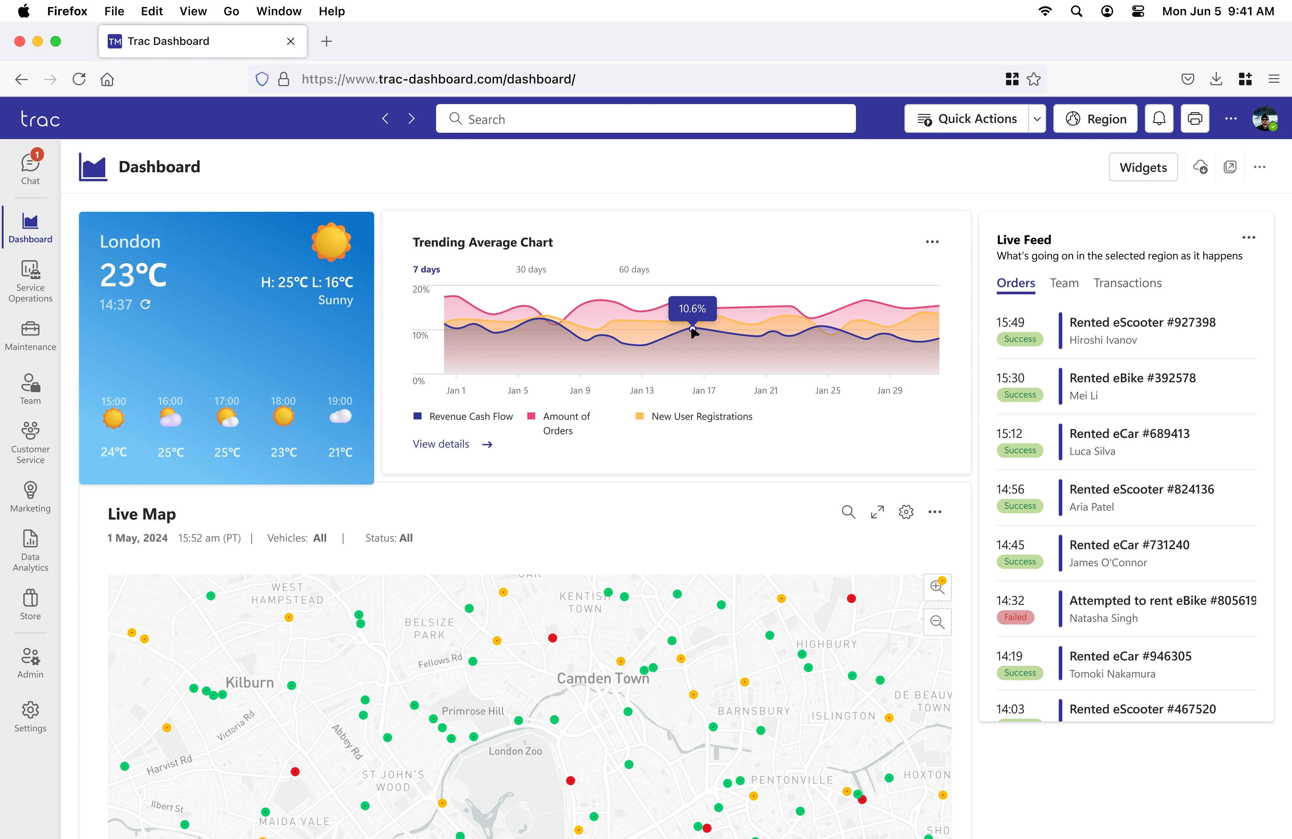
Before
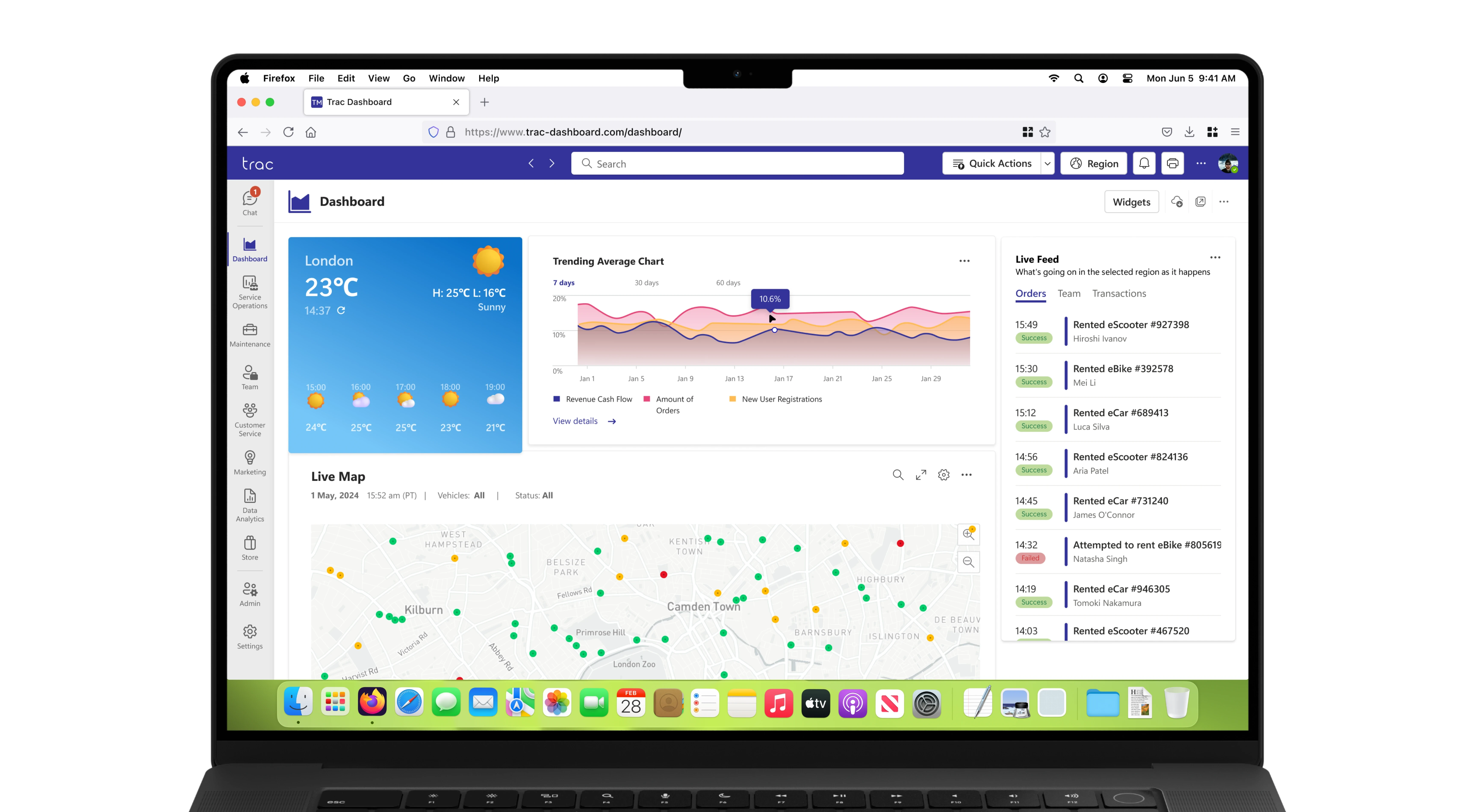
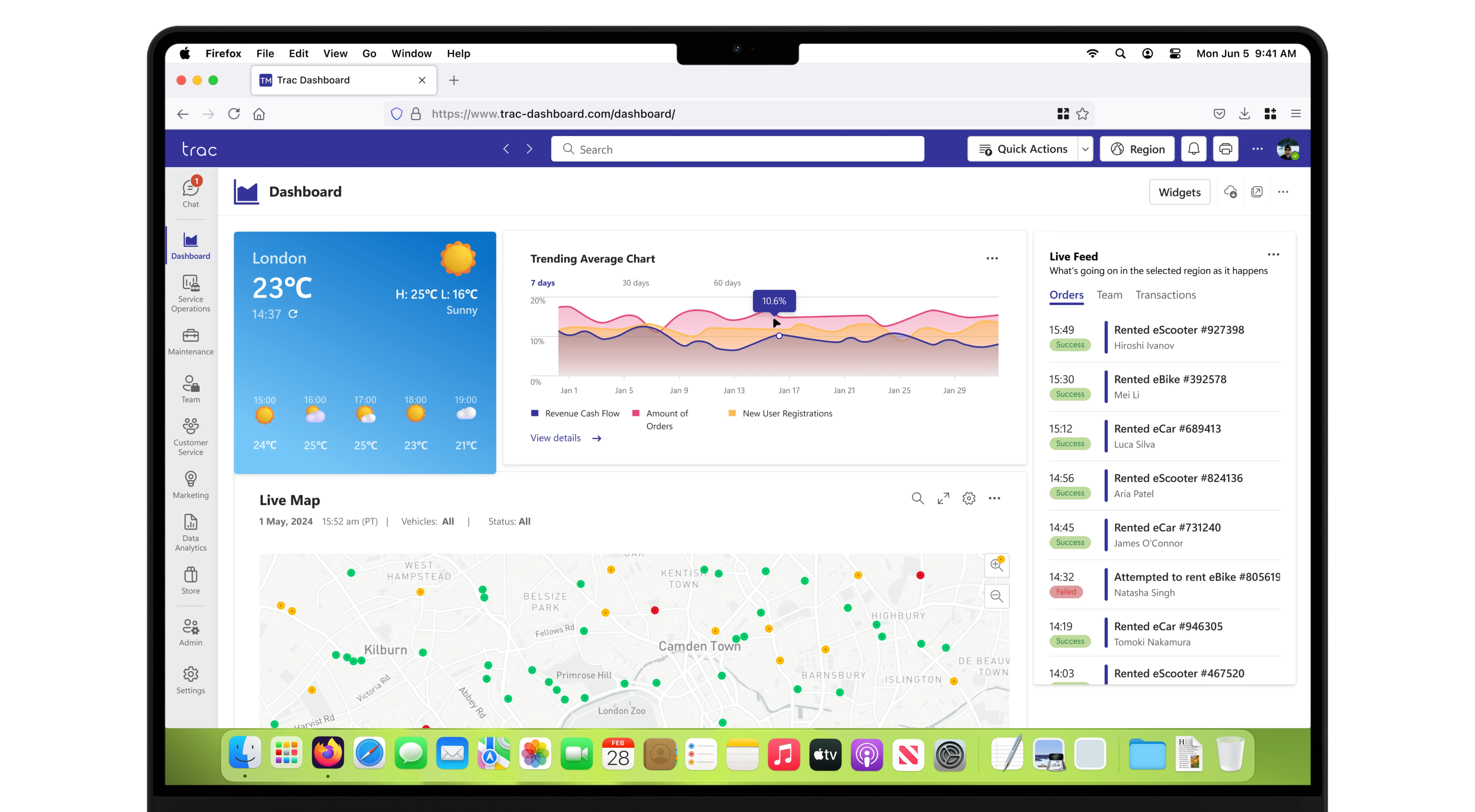
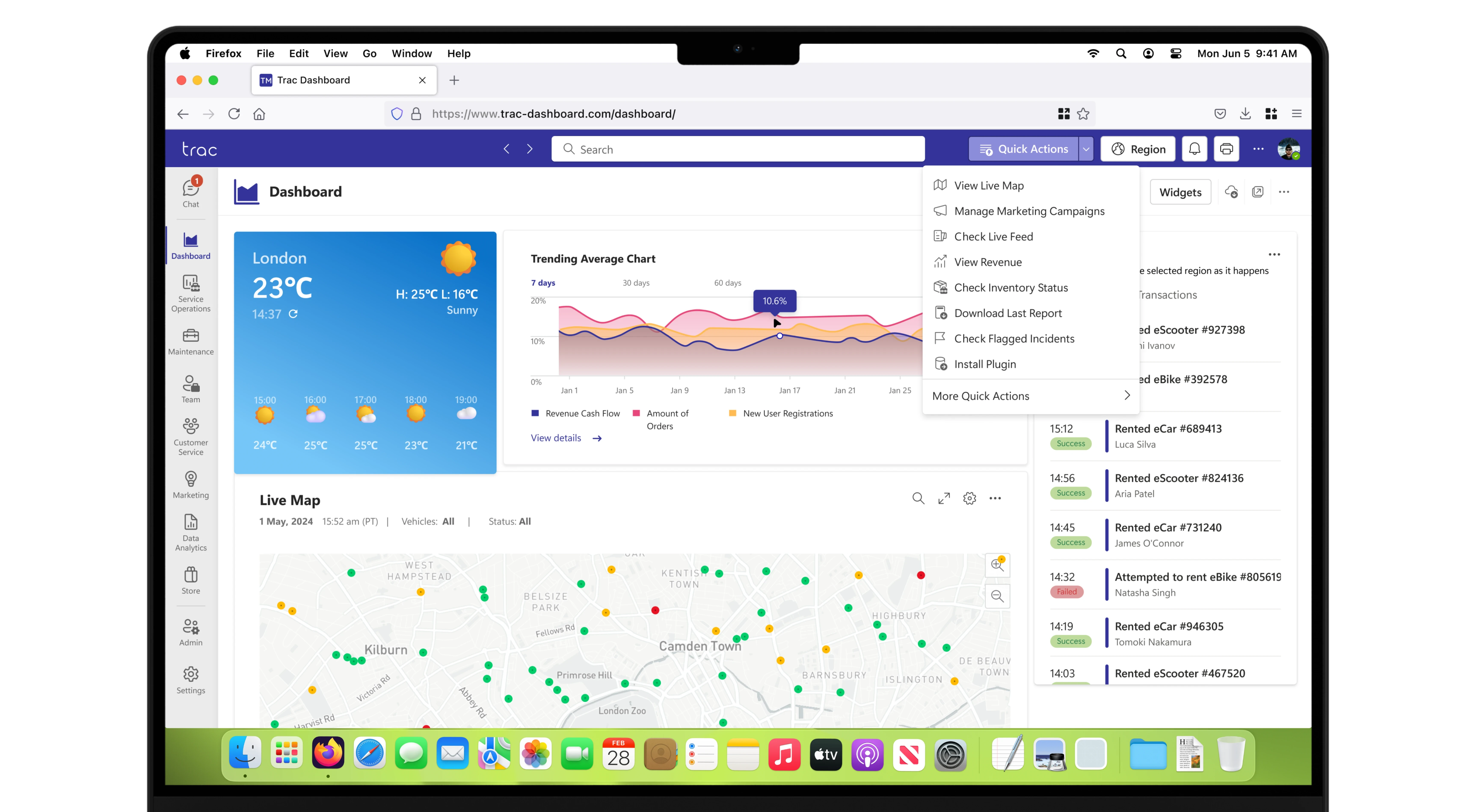
Dashboard
Featured a two-column widget layout, including weather, common actions (shortcuts), a live trending chart, and a live map. Notification, messages, customisation, and store link buttons were fixed in the header.

After
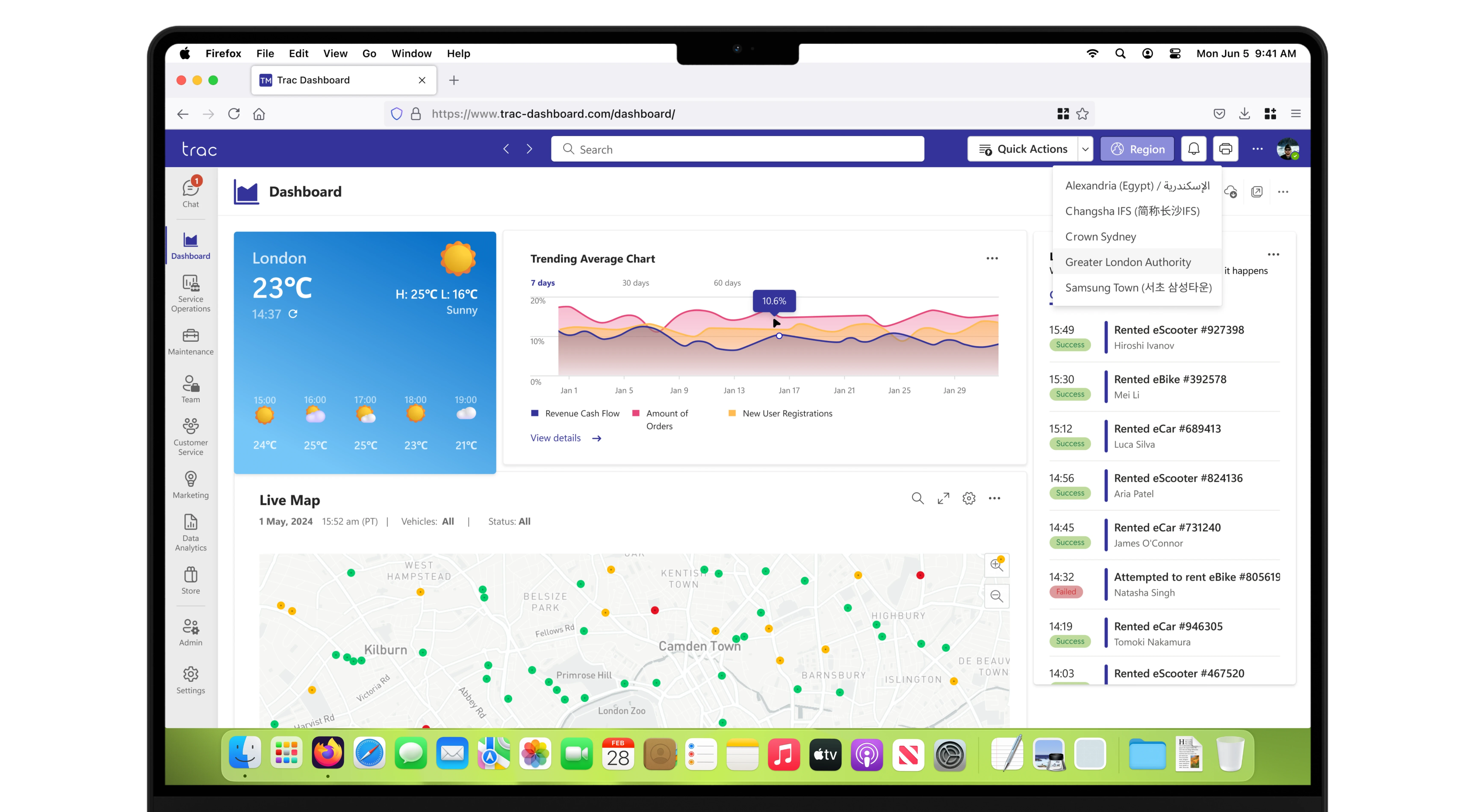
Dashboard
Widgets were redesigned for clarity and readability, adhering to Fluent Design System principles. Common actions were removed, and the side menu was revamped. The live map became larger, clearer, and gained optional filters. Header buttons were replaced with streamlined widget editing, download, share, and options buttons.
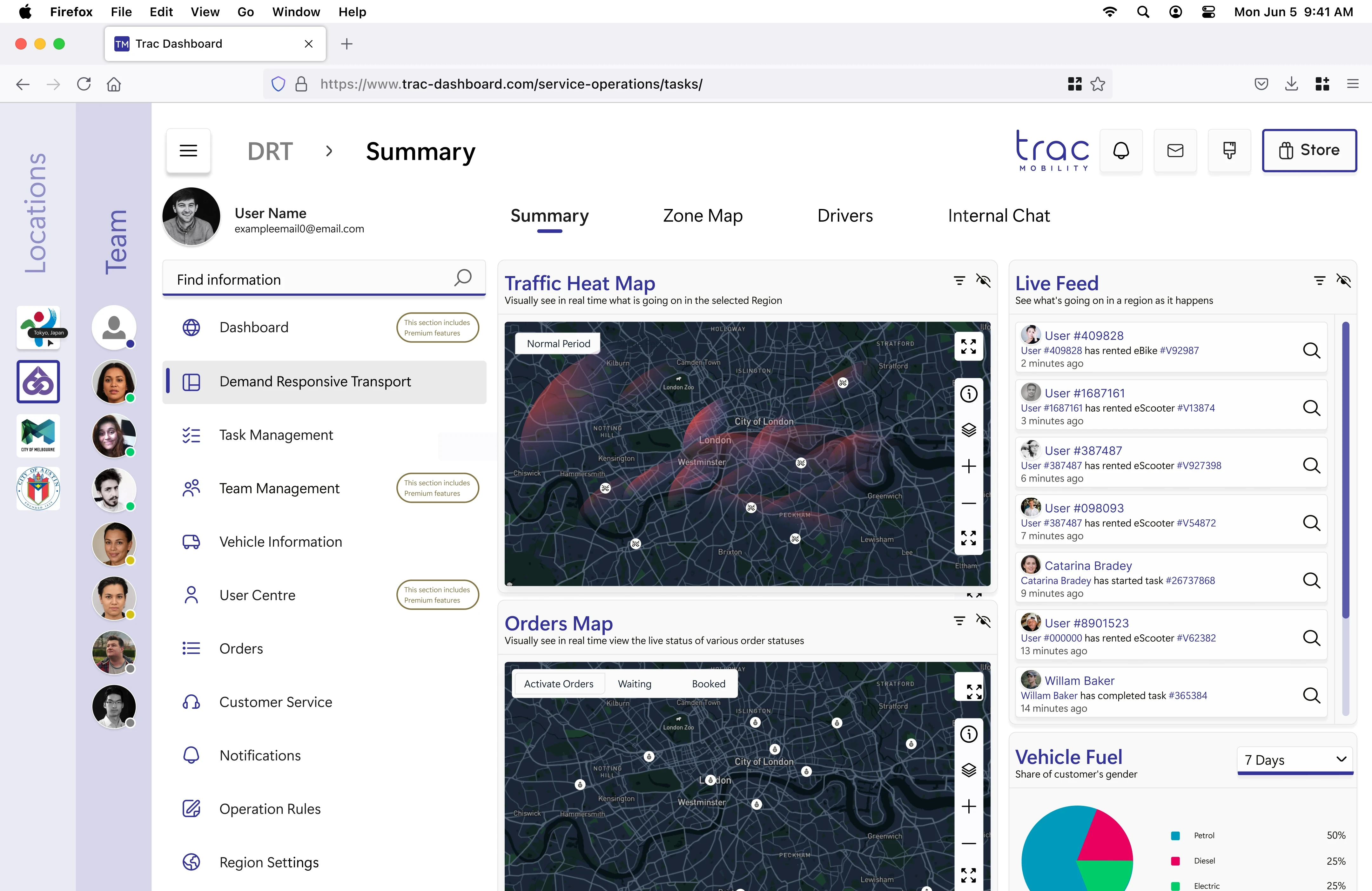
Before
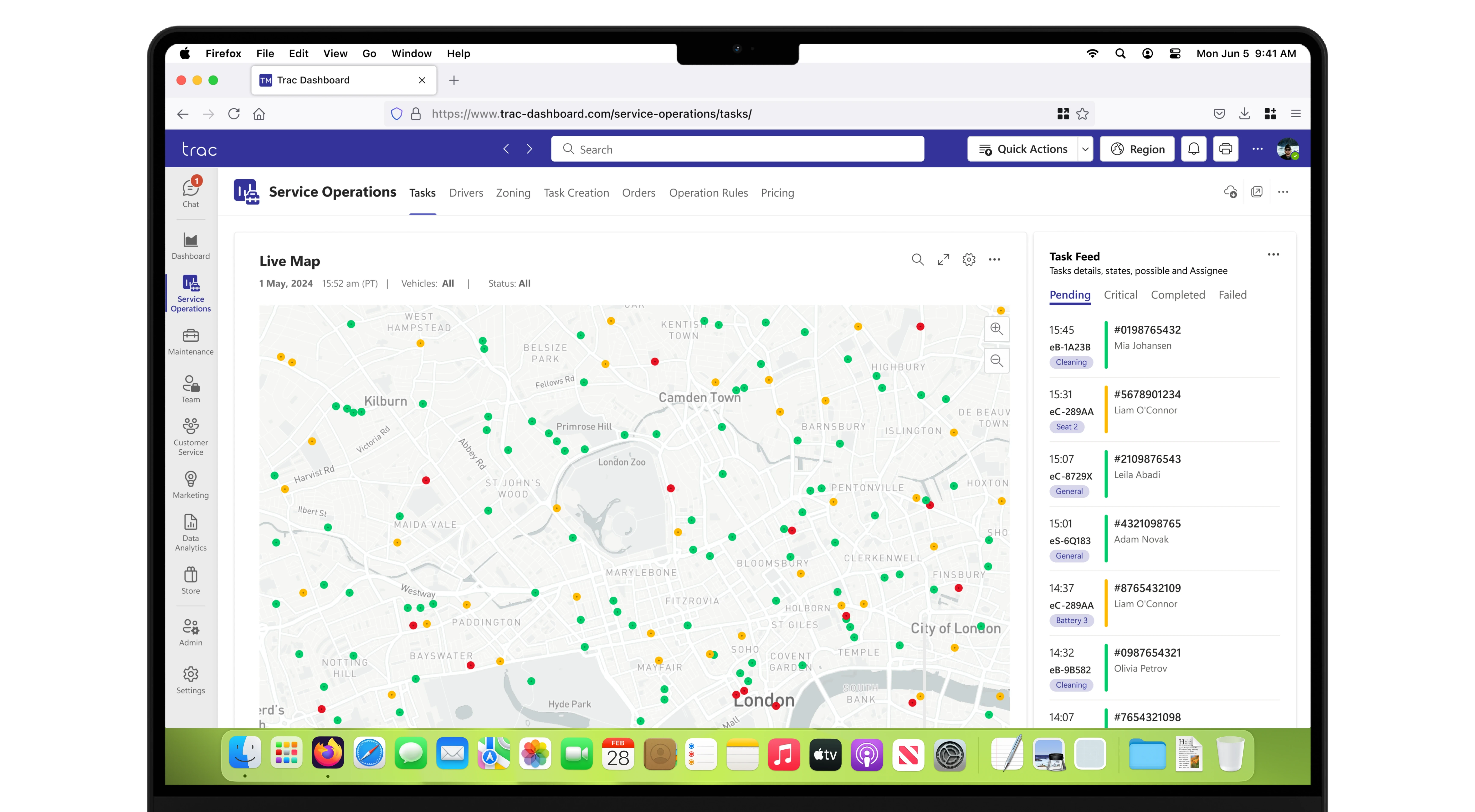
Live Operations
Known as DRT (Direct Responsive Transport), it included a traffic heatmap, an orders map, a live feed of orders, and a pie chart for vehicle fuel types. Maps could be viewed in full screen.
After
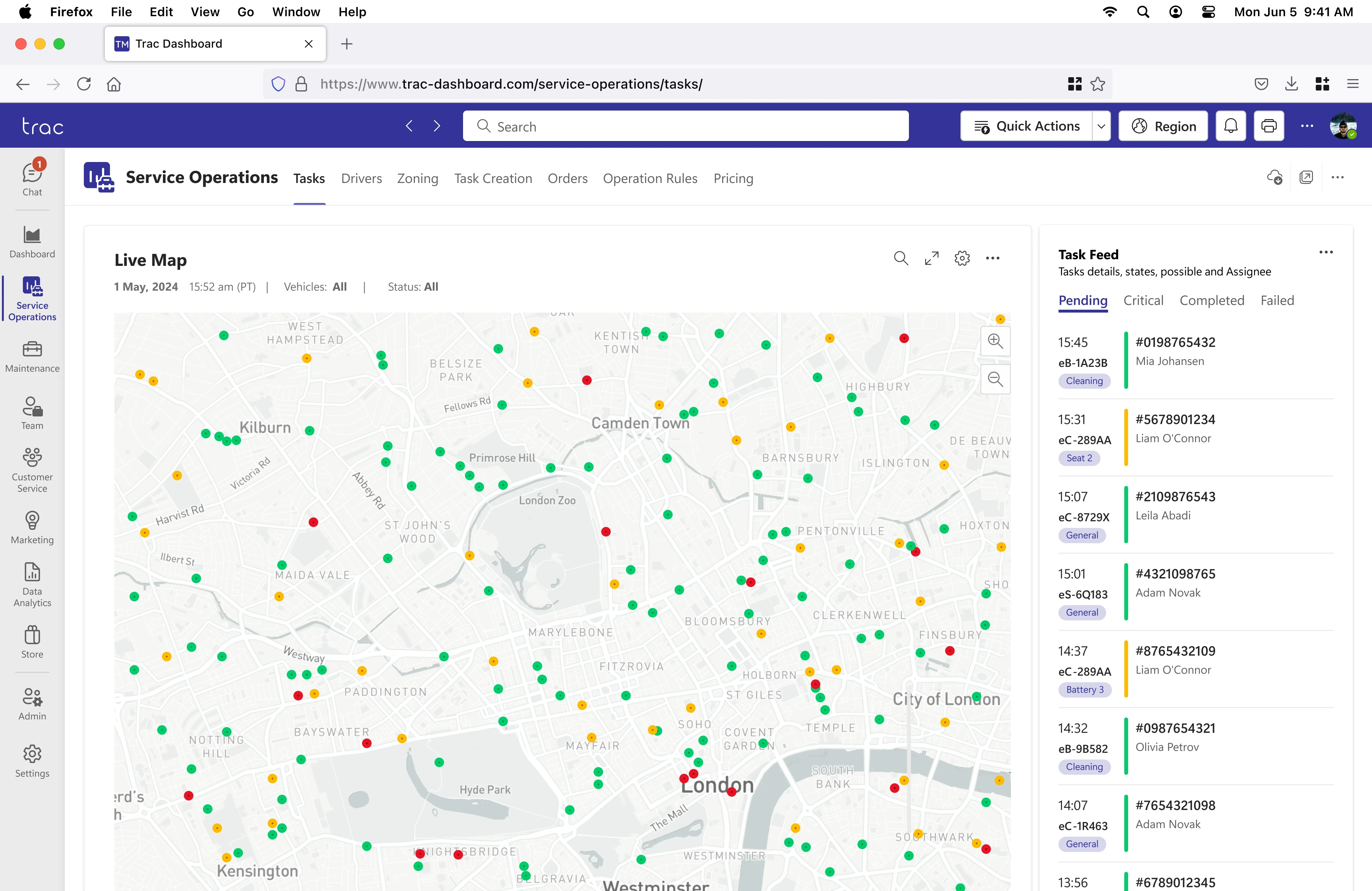
Live Operations
Renamed Service Operations for clarity. The order and heat maps were moved to dedicated tabs, and the live map now provides a general service overview with filters and full-screen options. The live feed was replaced with a task feed featuring status-filtering tabs.
Before
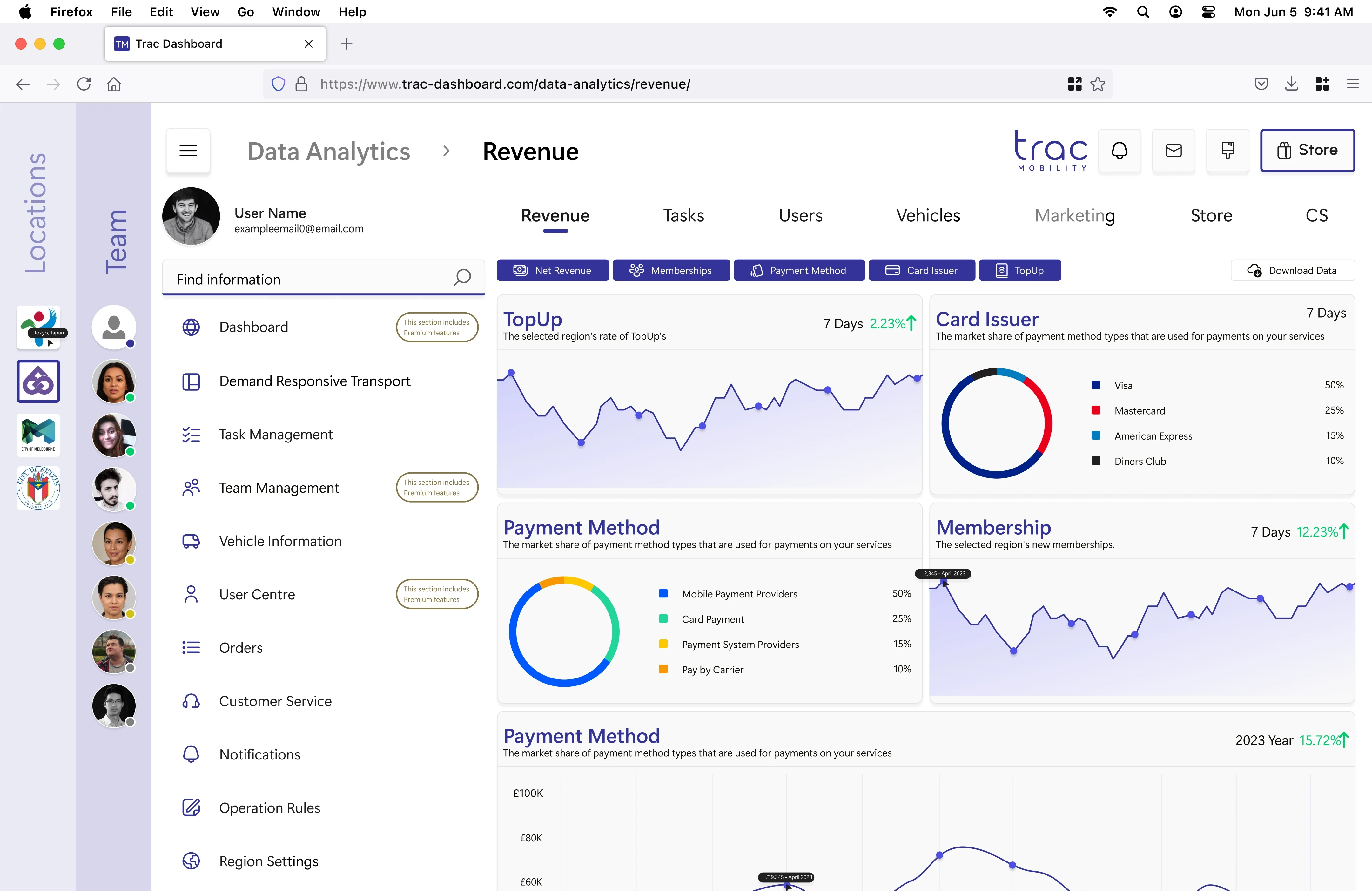
Data Analytics
The landing page displayed revenue data and widgets for commonly viewed metrics. A toggle system allowed users to turn widgets on or off, and a download button was present for data export.
After
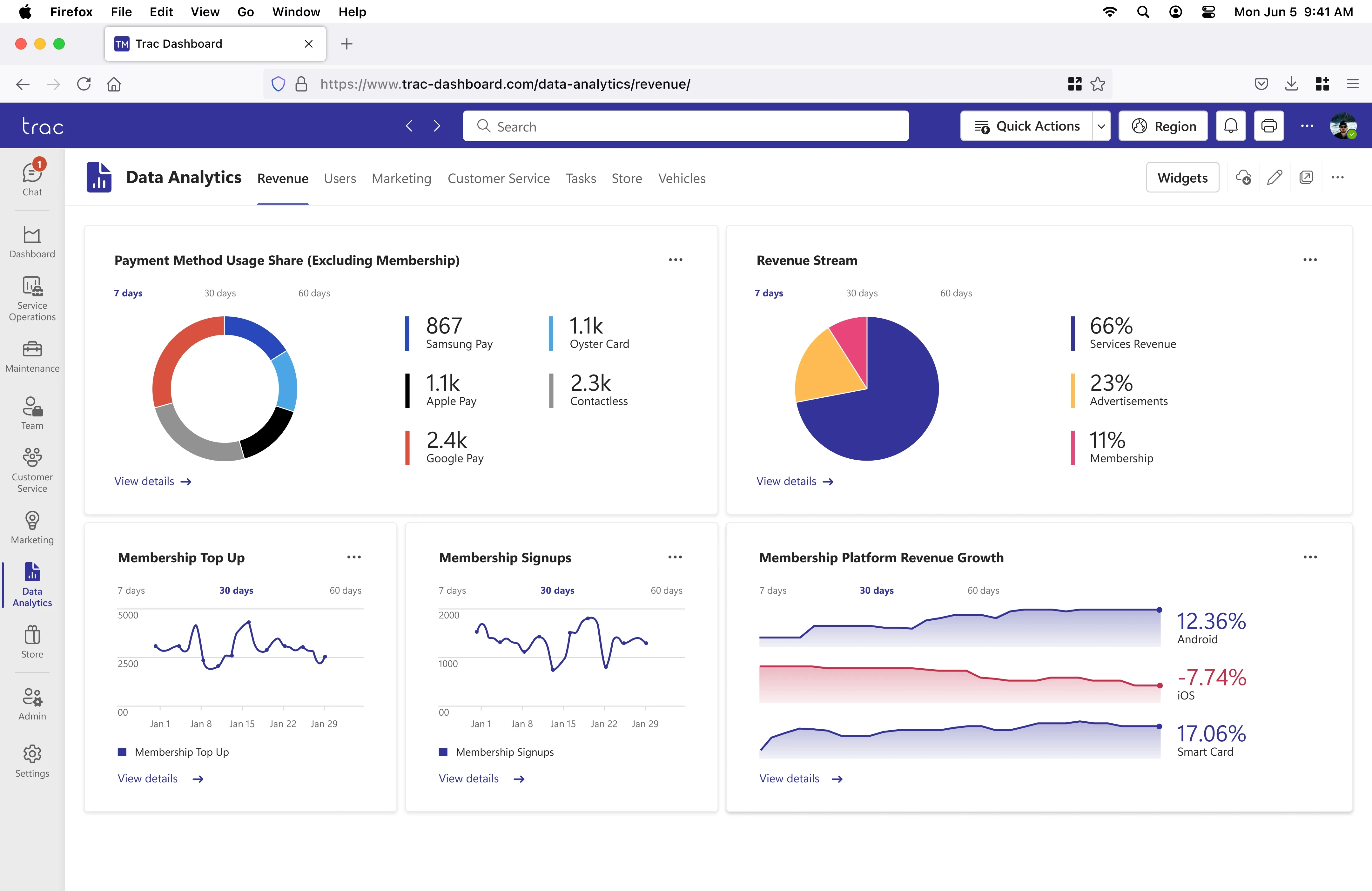
Data Analytics
Charts were redesigned with improved clarity and better labelling, and quick links were added for direct navigation to specific data. The widget toggle system was replaced with a consistent widget options button, aligning with the dashboard.
Design System
This project utilised the Microsoft Fluent Design System for its well-defined framework and neutral aesthetic, avoiding alignment with any single brand identity. A 2023 personal refresh incorporated Microsoft Fluent 2 Web and Fluent System Iconography in Figma to address design flaws of the original project, apply new skills, and reflect my transition to Figma.
During the original design process at TRAC Mobility (2021–2022), Adobe XD was used. In the absence of official Fluent files for Adobe XD or Figma, community-created resources were leveraged to ensure adherence to the design system.


Project Thoughts
The TRAC Dashboard was my first major professional design project, marking a transition from university work to real-world applications. Initially, it was daunting, with a steep learning curve and the challenge of impacting an already live product. Through extensive iterations, experimentation, and learning about design systems, I grew significantly as a designer during the process.
Returning to this project in 2023, with more experience, allowed me to refine and elevate the original design from 2022. The improvements highlight my growth in confidence, skills, and ability to tackle complex challenges. Reflecting on this journey, it was both a valuable experience and a foundation for building future expertise.